How To Customize A Squarespace Template (7 Tips From A Pro Designer)
One of the major appeals of a website builder platform like Squarespace is that it’s super easy for any entrepreneur or small business owner to create their own website and build an online clientele. However, as easy as it can be to get up and running fast, I find that a lot of people still struggle with how to get a “custom” look with a Squarespace template or how to “break free” of the standard template look. Many of my custom web design clients come to me after already having spent weeks or months trying to customize their site but ultimately failing to bring their vision to life. If you’re not a website designer, then creating a website that feels branded, professional and personal to your business might feel impossible. I wanted to create this article to share a few secrets that I myself, an expert website designer, use to customize the sites I that create for my clients. These techniques are easy enough for anyone to implement and I hope they can bring some personalization (and relaxation) into your next Squarespace site. Enjoy!
*This post contains affiliate links. I earn a small commission when you click on the links and make a purchase. This comes at no additional cost to you. Affiliate links are marked with an asterisk.
1. Create your own background images
Background images for page sections can bring so much organization to any website page. If you’re struggling to organize your page content and finding yourself just throwing in text and images with no real flow, I highly suggest you select a Squarespace Template* that utilizes Index pages (such as the Brine template family). Index pages easily break your website content down into sections and make it easier for your website visitors to navigate through your site. You can assign different background images to your each of your Index pages, giving your site the illusion that it’s perfectly organized and customized.
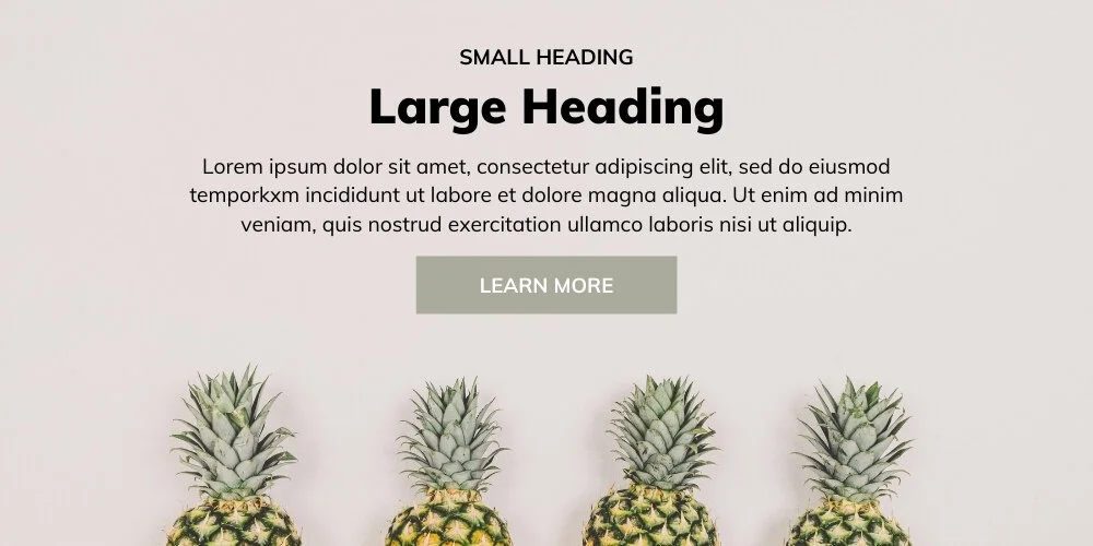
When I say “background images”, I don’t mean literal photographs. Background images can be so much more than just images. They can be solid colors or patterns or simply a totally white image that contains a design element such as a flower or a line to add some texture & depth to your site. Let me show you a few examples:
↑ Solid cream color background image with pineapples inserted at the bottom
↑ Using a wavy thick blue line from Canva* as a background image
↑ Using an isolated eucalyptus flower on top of a solid white background
↑ Using a wavy line on top of a solid white background. Image Source: Big Cat Creative, Unearth Template Kit*
2. Use Canva* to create custom graphics
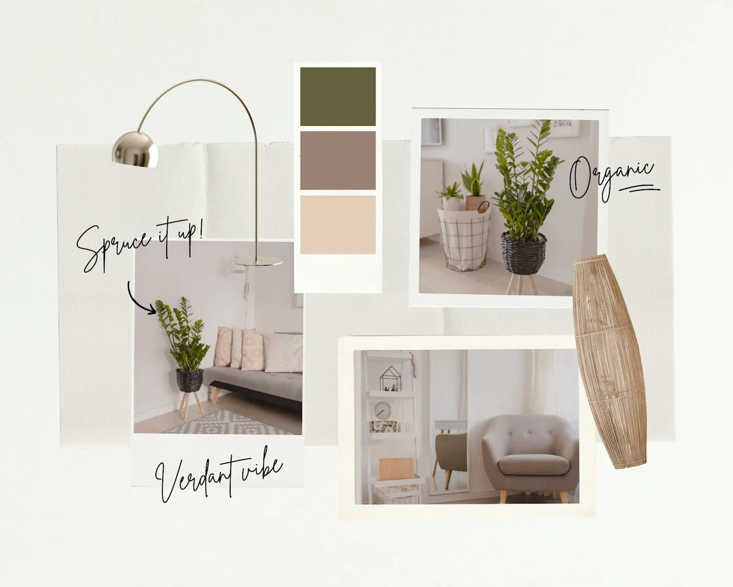
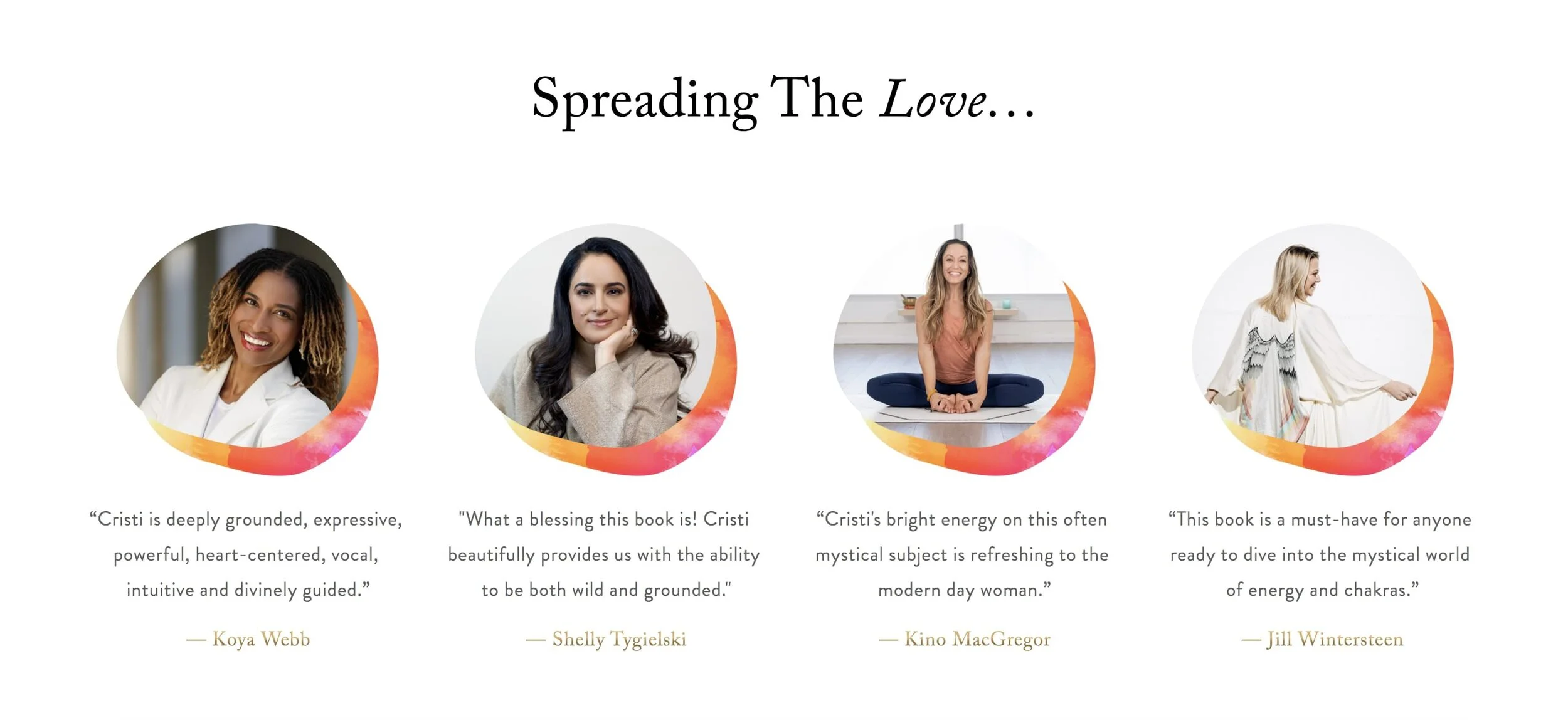
Custom graphics are such a great idea for adding personality to your Squarespace sites. However, not everyone can be a talented graphic designer overnight. That’s why graphic design platforms such as Canva* are so great. Canva makes it easy for anyone to create professional looking images and graphics to add to their websites. They have an endless number of templates to choose from. And all you really need to do is upload an image, maybe tweak a few things and click download. And boom! Your custom graphic can be uploaded to your website. Here are a few examples of custom Canva graphics:
↑ Create layered Images with Canva*
↑ Create image collages with Canva*
↑ Create custom testimonial thumbnails with Canva*
3. Use images that contain your brand colors
Before you embark on any website building journey, you should have a general color palette picked out for your site. Here are some great ideas for website color schemes. Clients often ask me what type of images they should include on their website. And I always respond with one important tip whether they’re using stock images or having a professional photo shoot. The tip is to incorporate your brand colors into your images as much as possible. So for example, if your website color scheme will be blue and yellow, find stock images that contain pops of blue and yellow. If you’re having a photoshoot with your team, tell everyone to come to work wearing blue or yellow somewhere in their outfit. Maybe take some photos in front of your blue couch, holding a yellow coffee mug.
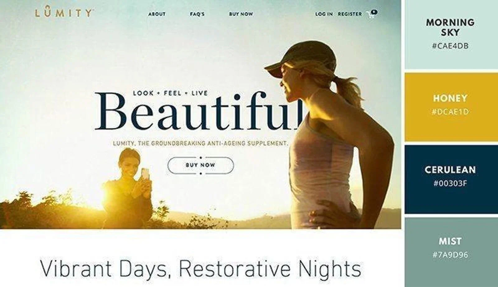
Incorporating your brand colors into your website images bring so much customization and professionality into your site and this step should never be overlooked in my opinion. Here’s an example of a website that uses their brand colors brilliantly in their main banner image:
↑ Use images that contain your brand colors
4. Use plugins to create custom functionality
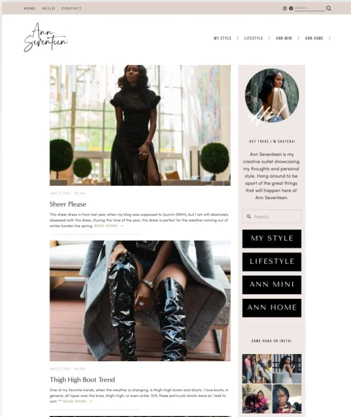
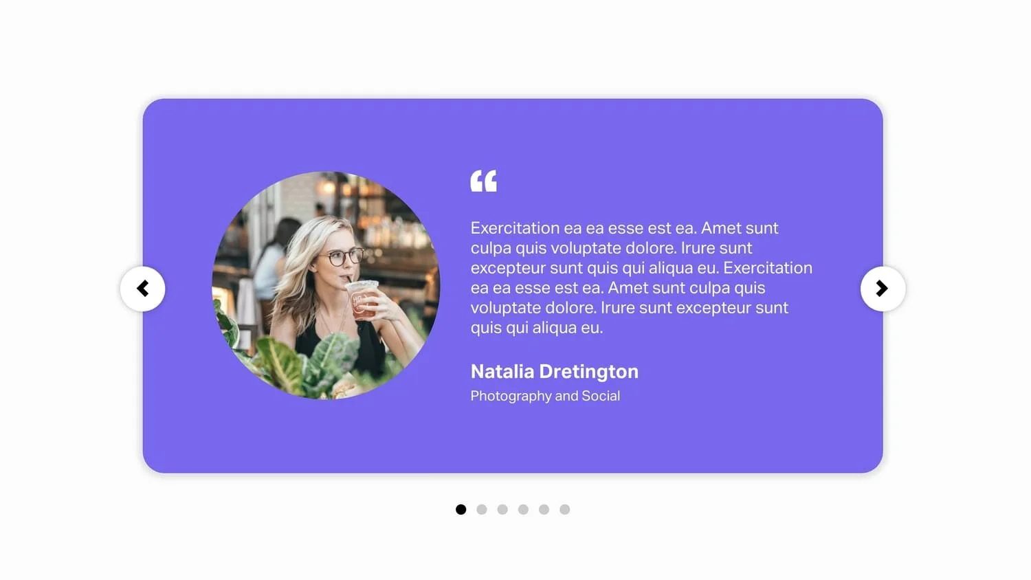
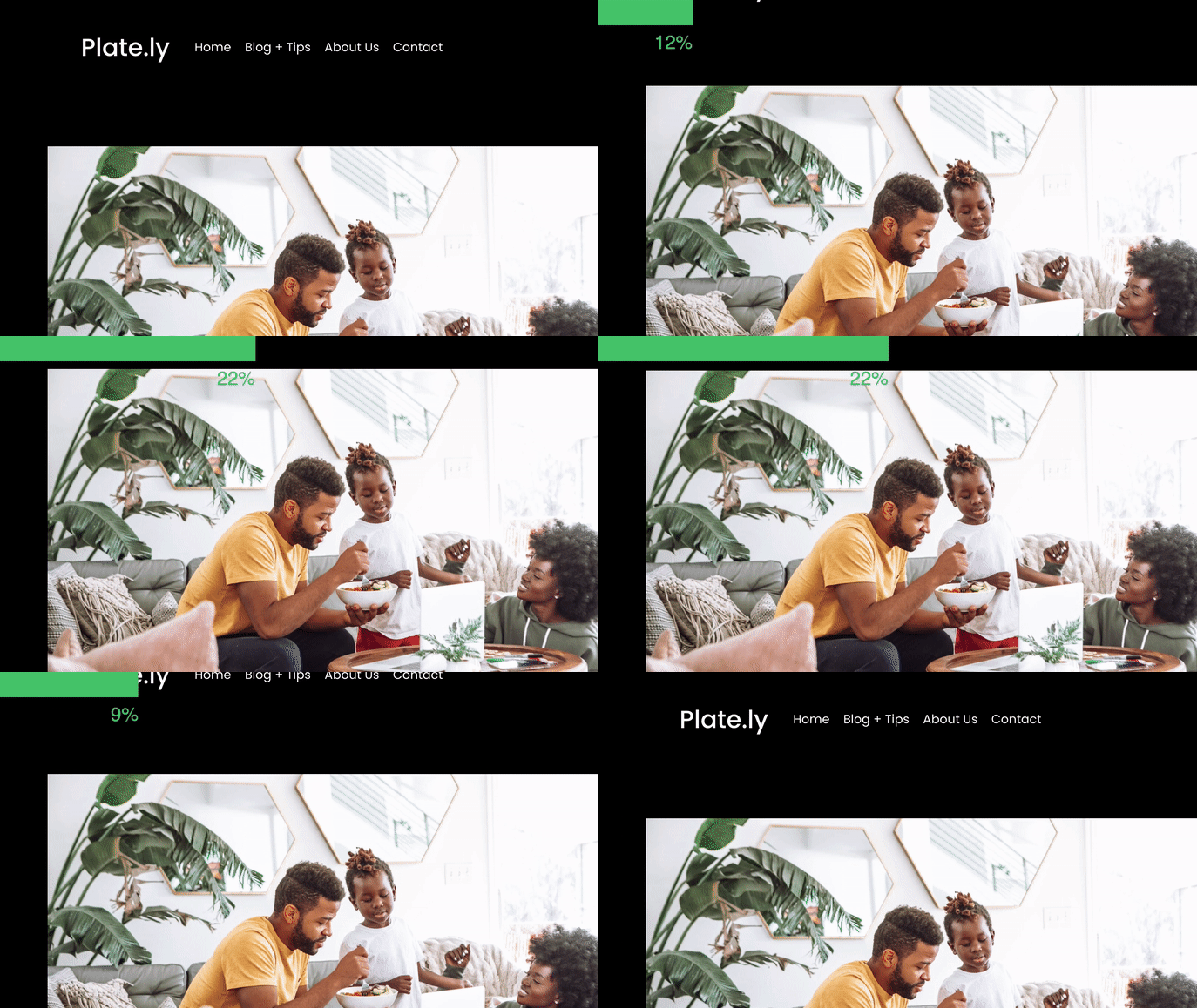
Squarespace plugins allow you to level up your website design without having to know CSS. There are so many amazing plugins available for purchase from 3rd parties. A couple of my favorites are Ghost Plugins* and SQSP Themes*. These guys offer plugins that allow you to add so much customization to your site through plugins such as: Blog Sidebar, Accordion Tabs, Testimonial Slider and As-You-Scroll Progress bar. Examples of all can be seen below:
↑ Blog Sidebar* (great for providing your visitors with more info about you / where to click next)
↑ Accordion Tabs* (for interactive FAQs)
↑ Testimonial Slider* (great for making client reviews stand out)
↑ As-You-Scroll Progress Bar* (great idea for engaging visitors on Blog Posts)
5. Use a fun accent font for small sayings/phrases
Add some personality to your website through accent fonts and short phrases. For example, if you have a section on your website that features client testimonials, spice it up by adding a header that contains a fun phrase and give it a decorative font. Check out my example below:
↑ Use a fun accent font for small engaging phrases (“the people have spoken“)
6. Integrate your website with Instagram
Squarespace allows you to add “social blocks” to any of your website pages. A great way to customize the look of your site is to add an Instagram block to the footer of your site. Then, on Instagram you can post images that match your site aesthetic and contain your brand colors. Squarespace will automatically display your most recent Instagram posts, and if your posts coincide with your site design, this can really elevate your site style and give a personalized, branded look. Take a look at my example below:
↑ Add an Instagram block to your site + publish posts that fit your brand aesthetic
7. Buy a custom template!
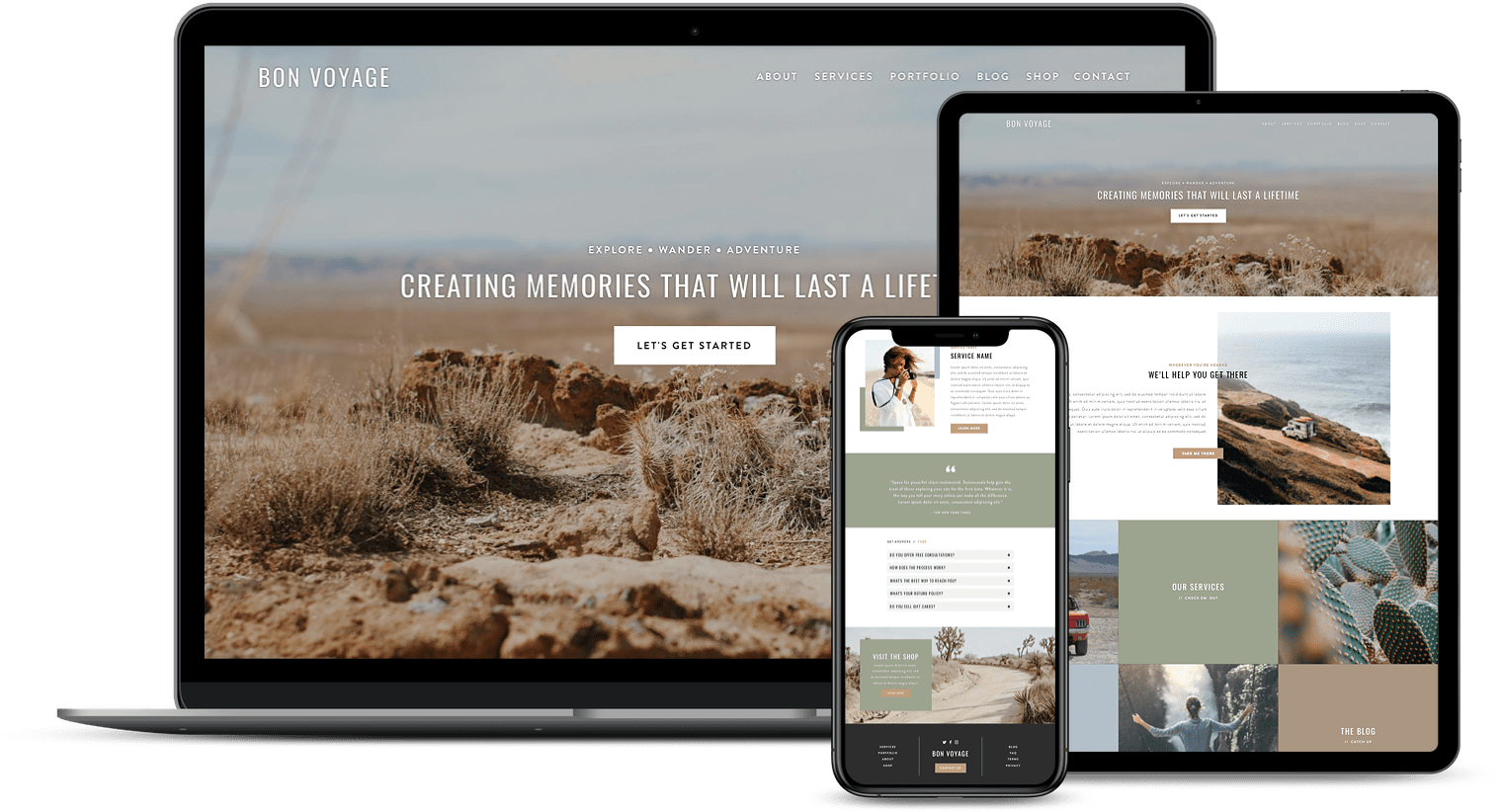
Not everyone is cut out for the web design life. And that’s totally ok! No one expects you to create a stunning, custom website if your profession is real estate. That’s why Premium Squarespace Templates are so great. They allow you to get a custom look without the custom price tag. With premium templates, all you need to do is select a template that fits your style, upload your content and hit publish. Sometimes it’s easier to leave the designing to the designers! And premium squarespace templates allow you to do just that.
Browse Premium Squarespace Templates
My modern, service-based templates are designed for entrepreneurs and small businesses who are looking for a professional website design without breaking the bank. Each one of my templates include video tutorials for easy content upload / style tweaks. I also include my Advanced SEO Guide (a $500 value). This guide contains the exact techniques I use to help my SEO clients land on Google page 1.








![50+ Best Premium Squarespace Template Shops [2025]](https://images.squarespace-cdn.com/content/v1/5fac4b921ca05f08cb315e40/1735848204800-I3GDILCDSSJO3EM3BVAW/Premium+Squarespace+Templates%2C+Squarespace+Templates%2C+Squarespace+Templates+For+Sale%2C+Best+Squarespace+Templates%2C+Custom+Squarespace+Templates%2C+Squarespace+Premium+Templates%2C+Squarespace+Website+Templates%2C+Squarespace+Custom+Templates.jpg)


