25+ Best Squarespace Ecommerce Website Examples [2025]
Whether you’re just starting out or you’ve been running a successful Squarespace Ecommerce* business for years, you might need a little inspiration to help take your shop to the next level. Creating a successful online store with Squarespace doesn’t have to be intimidating. With the right strategy in place, you too can create an ecommerce shop that consistently reels in leads and makes sales 💸
A well-designed, easy to navigate website design can really build some solid trust and credibility with potential customers. However, it can be difficult to brainstorm all of the features that you need to include on your ecommerce site. So I’ve complied this ultimate list of Squarespace Ecommerce websites to help you gain a little inspiration and hopefully make some improvements to your shop.
With Squarespace, it’s 100% possible to create an aesthetically pleasing and fully-functional ecommerce website. From pet supplements to press-on nails to wine shops, we’ll take a look at how other’s are utilizing Squarespace to it’s fullest potential to create captivating, profitable ecommerce shops.
This article not only shows off inspiring ecommerce examples, but also outlines how you can get the most out of your Squarespace store with additional features and plugins. I happily describe my very favorite features about each shop and explain how you can replicate the same features for your Squarespace shop. And to help you out a little further, I’ve included 5 essential tips for maximizing the potential of your Squarespace Ecommerce store. Stay tuned at the end of this inspiration list for those bonus tips! Alright, let’s dive in!
*This post contains affiliate links. I earn a small commission when you click on the links and make a purchase. This comes at no additional cost to you. Affiliate links are marked with an asterisk.
8 Must-Have Features For Your Squarespace Ecommerce Shop
User-Friendly Navigation. It’s an absolute must for customers to be able to easily find what they need
Search Bar. Allow customers to bypass navigation links and immediately find what they need
High-Quality Images. Investing in professional, high-quality images will 100% pay off in the long-run
Product Reviews. Providing social proof to shoppers is a fantastic way to build credibility with new visitors
Clear Return Policy. Let your customers know exactly what to expect should they need to make a return
FAQ. Increase sales + reduce customer uncertainly by answering questions before they arise
Email Opt-In. Turn on email opt-in for your checkout process. Subscribers will become repeat customers!
Top-notch support. Answer customer inquires quickly & with great detail. Think about installing a chatbot*
Quick Links:
⟡ Bloom Culture DIY Flowers | Visit Website
⟡ Staay Pet Supplements | Visit Website
⟡ Adventures in Kindness | Visit Website
⟡ Karen Gordon Hair Loss Solutions | Visit Website
⟡ Katie Fischer Design | Visit Website
⟡ Jones Bar-B-Q | Visit Website
⟡ Minna Sparkling Tea | Visit Website
⟡ Soilboy Plants | Visit Website
⟡ Artips Press-On Nails | Visit Website
⟡ UNWRP Wrapping Paper | Visit Website
⟡ Blackbird Foods | Visit Website
⟡ Sarah's Day Fitness | Visit Website
⟡ Prodigy Academie | Visit Website
⟡ Blush Leaf Shop | Visit Website
⟡ The North Coal | Visit Website
⟡ Little Clay Land | Visit Website
⟡ BeFound Collective | Visit Website
⟡ Your Social Team | Visit Website
⟡ Lattes & Leases | Visit Website
⟡ iLoveCreatives Studio | Visit Website
⟡ H2O Tank Avenue | Visit Website
⟡ Plants by Post | Visit Website
⟡ Evolving Minds | Visit Website
⟡ MultiThreads Embroidery | Visit Website
⟡ The Sorry Girls | Visit Website
⟡ Dungeons & Documentation | Visit Website
⟡ Clare Nicolson | Visit Website
⟡ Mingua Beef Jerky | Visit Website
#1. Bloom Culture DIY Flowers
While compiling this list of Squarespace ecommerce examples, I stumbled upon this website around #18. I immediately moved it to #1 and wrote in my notes “wow…”. This site sells DIY flower collections and is seriously fantastic. Their overall design is elegant and modern while still being highly approachable. I feel it really appeals to the DIY, crafty type of person. It’s definitely worth taking a look at for a little inspiration.
Favorite Features:
➡️ VARIANTS AS BUTTONS. If your shop only has a few variant options, it’s generally a good idea to forgo the default drop-down list style and opt for a more visually pleasing option, such as buttons. This website wonderfully incorporates the style of displaying their product variants as buttons, rather than drop-downs. I love how the user can immediately see all available options without having to click to open up anything.
⟡ HOW TO REPLICATE: Purchase the Product Color/Image Swatch Variant Plugin* from SQSP Themes.
➡️ THUMBNAIL IMAGES. This site incorporate image swatch colors directly into the thumbnail image which is clever because anyone who’s ever tried to create these little image swatches in Squarespace knows just it’s not possible without custom code.
⟡ HOW TO REPLICATE: Use Canva* to create similar style thumbnail images.
➡️ DROPDOWN FILTERS. No Squarespace Ecommerce website is complete without the ability to filter products. This website allows visitors to filter by color and flower in a clean, simple way.
⟡ HOW TO REPLICATE: Make use of Archive Blocks on your shop pages. If you’re looking for a more robust way to organize large chunks of information on your Squarespace product pages, check out the Accordion-Tabs Plugin* from our friends over at SQSP Themes.
#2. Staay Pet Supplements
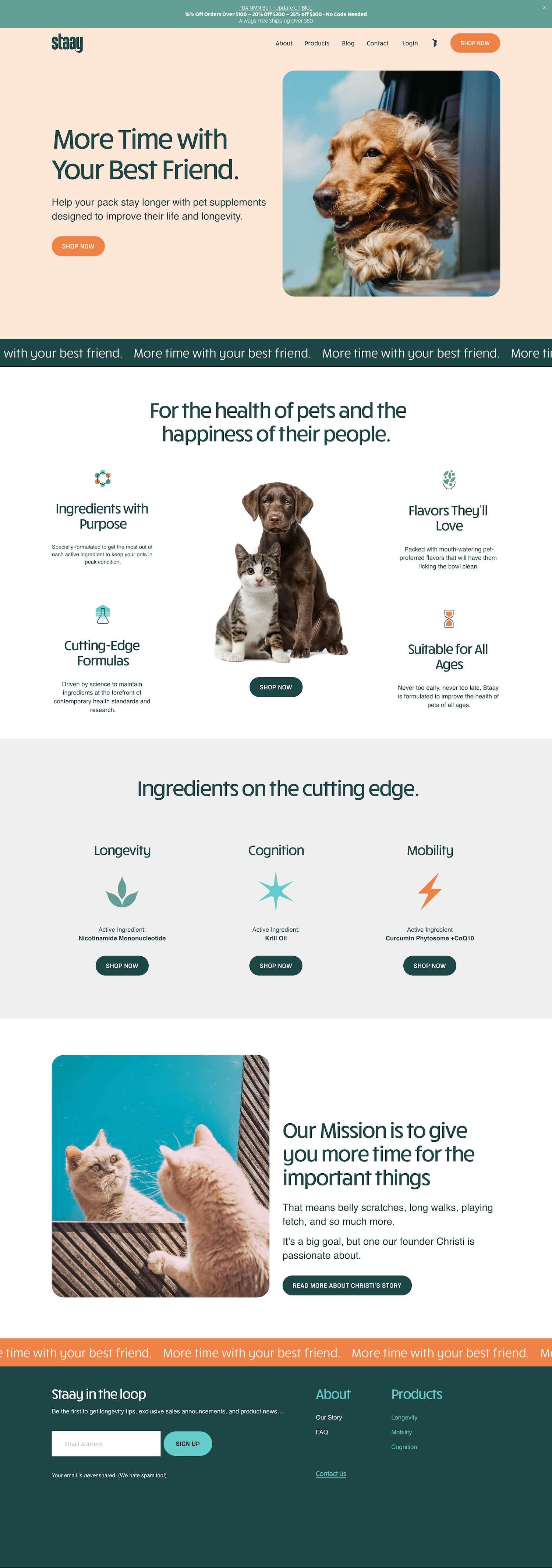
Staay is an adorable website that sells supplements to help improve your pet’s life and longevity. Who doesn’t love that! Their images, icons, animations, and overall branding is wonderful. From their bold, yet calm color scheme to their super cute animal photos, you really feel compelled to engage with the website and click around (even if just to see more cute pictures of dogs!).
Favorite Features:
➡️ SUBSCRIBE + SAVE. This is a great feature that allows customers to either make a one-time purchase OR purchase products on a reoccurring basis (by subscribing) for a discount. Products are shipped out automatically every week, month, 2 months (whatever your customer decides).
⟡ HOW TO REPLICATE: Purchase the Subscribe + Save plugin* from Snazzy View.
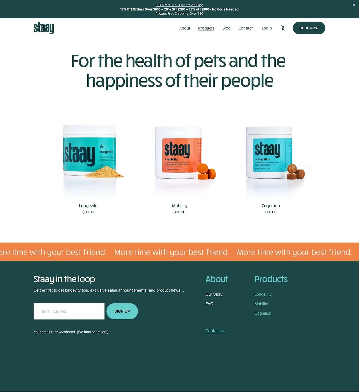
➡️ ALTERNATE IMAGE ON HOVER. This website has fantastic images of their supplement containers. On their main product page, I love how you can hover over any product and another image of the product appears. This makes it super engaging for potential customers to interact with and allows people to see a slight glimpse into the product without clicking on it just yet. This is a great way to show off a special feature, another angle, or a key detail for each product.
⟡ HOW TO REPLICATE: Squarespace 7.1 websites have this enabled by default! Some Squarespace 7.1 templates allow you to enable this feature in your style settings.
➡️ PRODUCT GIF ANIMATION. On this site’s individual product pages, they included a cool GIF animation that actually spins the supplement container around so you can see the full packaging. I thought this was a neat way to show off their nice-looking product packaging.
⟡ HOW TO REPLICATE: Use Canva* or GIPHY to create your own GIFs. Note: Canva allows you to easily convert MP4 videos to GIFs as well.
#3. Ave Lumi
Ave Lumi is an online retailer that primarily sells sustainable clothing for the whole family. I love their mission in curating clothes at an affordable price point, while consciously considering their impact on the environment. Their focus on sustainable fashion really helps their website stand out from other competitor apparel shops. The website is pretty simple, yet clean and welcoming while featuring soft neutrals and easy to read typography.
Favorite Features:
➡️ MEGA MENU. A mega menu is a type of expandable menu in which many choices are displayed in a two-dimensional dropdown layout. It’s an excellent design choice for accommodating a large number of options or for revealing lower-level site pages at a glance. This website brilliantly incorporated a mega menu to so that they could easily categorize and display all navigations links at once.
⟡ HOW TO REPLICATE: Purchase the Mega Menu plugin* from Snazzy View.
➡️ YOU MIGHT ALSO LIKE SECTION. At the bottom of each product page, they display a “you might also like section” which is a smart way to keep customers clicking around and potentially adding more items to their cart.
⟡ HOW TO REPLICATE: Enable Related Products in your Squarespace dashboard. This feature uses categories and tags to group products together.
#4. Adventures in Kindness
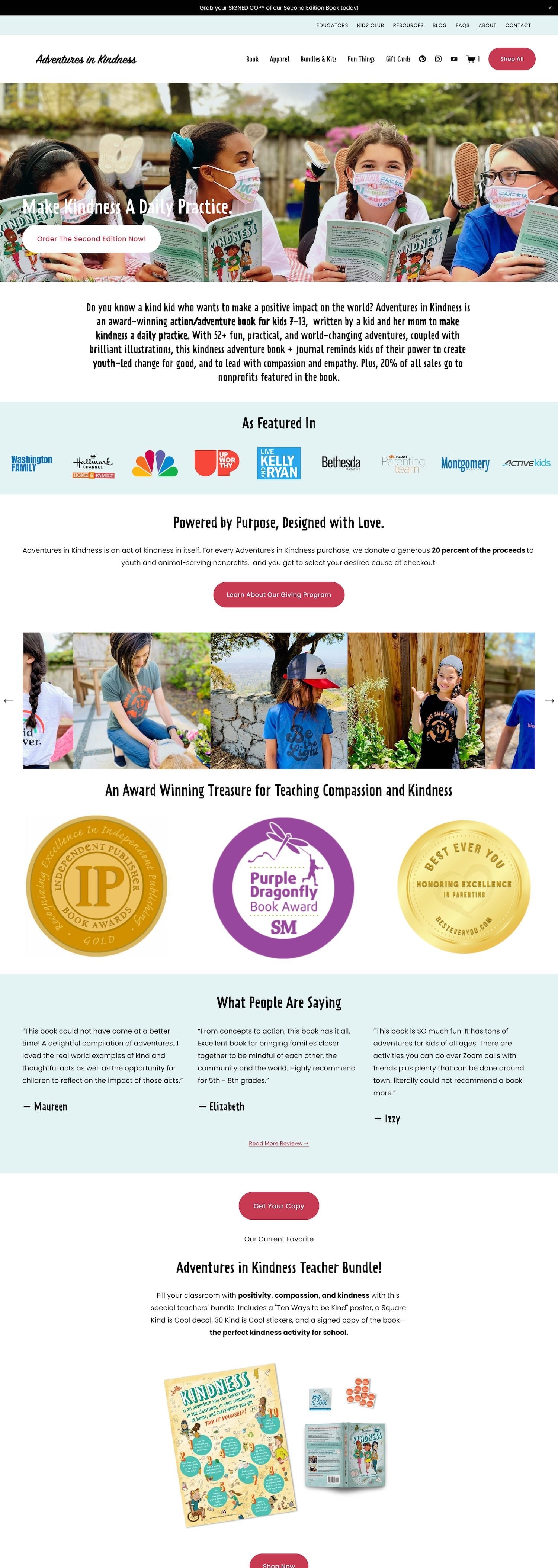
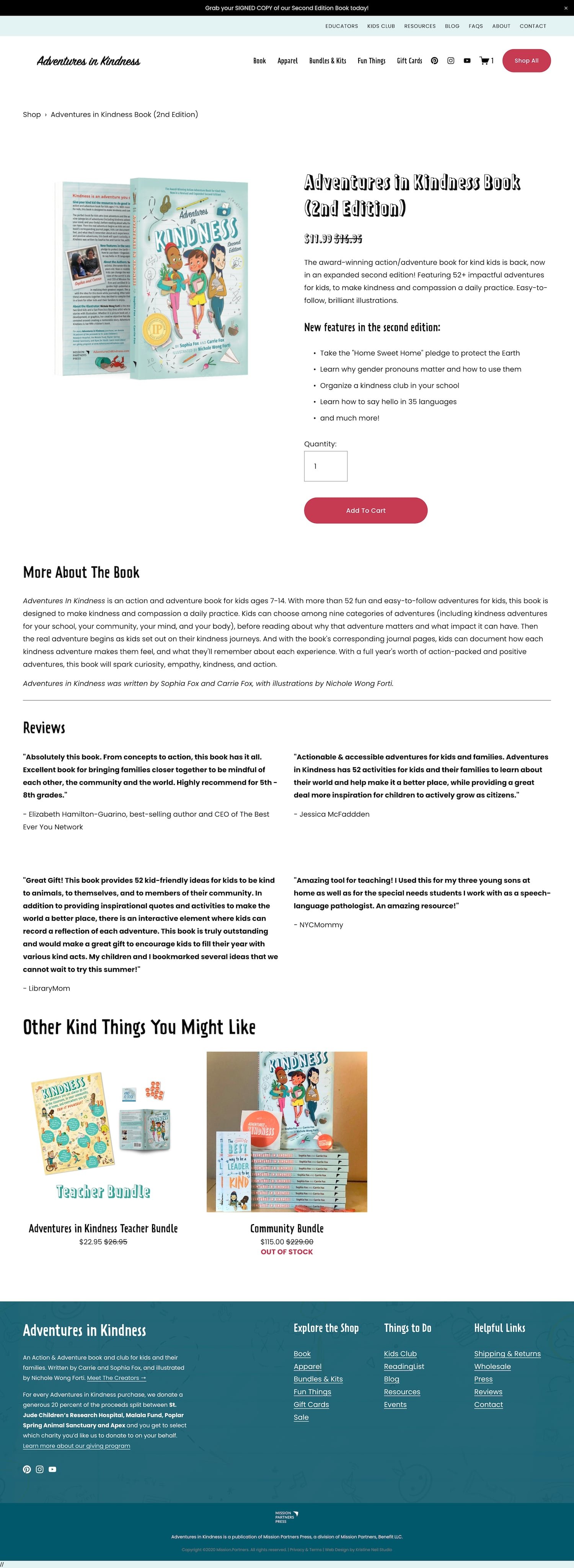
Adventures in Kindness has been featured on NBC and Live with Kelly & Ryan for their award-winning children’s book on kindness. They’ve made it their mission to help spread a little kindness in the world through adventures detailed in the book. Plus they generously donate 20% of proceeds to youth and animal-serving nonprofits. The cool part is, they let their customers select which charity they’d like to donate to at checkout.
Favorite Features:
➡️ SELECT A CHARITY AT CHECKOUT. This company kindly donates 20% of proceeds to nonprofits. They allow their customers to select which charity they’d like to donate to during the checkout process. Charity options include St Jude Children’s Research Hospital, The Malala Fund, Apex for Youth, and Poplar Spring Animal Sanctuary.
⟡ HOW TO REPLICATE: In your Squarespace dashboard, create a custom checkout form which will be added to the final checkout page.
➡️ STRIKETHROUGH PRICING. This is a very simple, yet effective feature that shows the product’s original price with a line through it and then a “sale” price next to it. This method allows customers to believe that they are getting a deal, therefore enticing them to make a purchase. Plus you can just use this feature to advertise a sale!
⟡ HOW TO REPLICATE: Create sale prices for products in your shop.
#5. AESOP Wines
AESOP Wines sells… you got it… wine! Specifically clean wine in California with direct-to-door delivery. They advertise creating wine that is sustainably farmed and contains all-natural ingredients, all at a fair price. Their website really stands out with it’s large beautiful images, gradient color selection, fun images shapes, and scrolling marquee blocks. I love how they also include accordion blocks with “Tasting Notes” for each wine.
Favorite Features:
➡️ SUBSCRIPTION PRODUCTS. This website offers the ability to purchase a wine subscription. They offer three different subscription levels including 4, 6, or 12 bottles per month.
⟡ HOW TO REPLICATE: In your Squarespace dashboard, make use of Subscription Products, as opposed to standard physical products.
➡️ SCROLLING MARQUEE BLOCKS. The scrolling blocks you’ll see moving across the screen on this website is a cool new Squarespace feature that allows you to add text that scrolls horizontally across the page, similar to a theater marquee or news ticker. This is quite an eye-catching feature in my opinion and really adds some movement to static web pages.
⟡ HOW TO REPLICATE: No plugin needed. Create a Scrolling Marquee Block on any Squarespace website page.
➡️ UNIQUE IMAGE SHAPES. This is another new feature that Squarespace recently released. Beyond the standing cropping and resizing of images , you can now shape image blocks to add variety and a unique visual effect to your images. To be honest, this feature can sometimes look a bit strange if not used tastefully. But this website does a fantastic job of utilizing this feature 👏
⟡ HOW TO REPLICATE: When editing your image blocks, set the image shape under the design tab.
#6. Karen Gordon Hair Loss Solutions
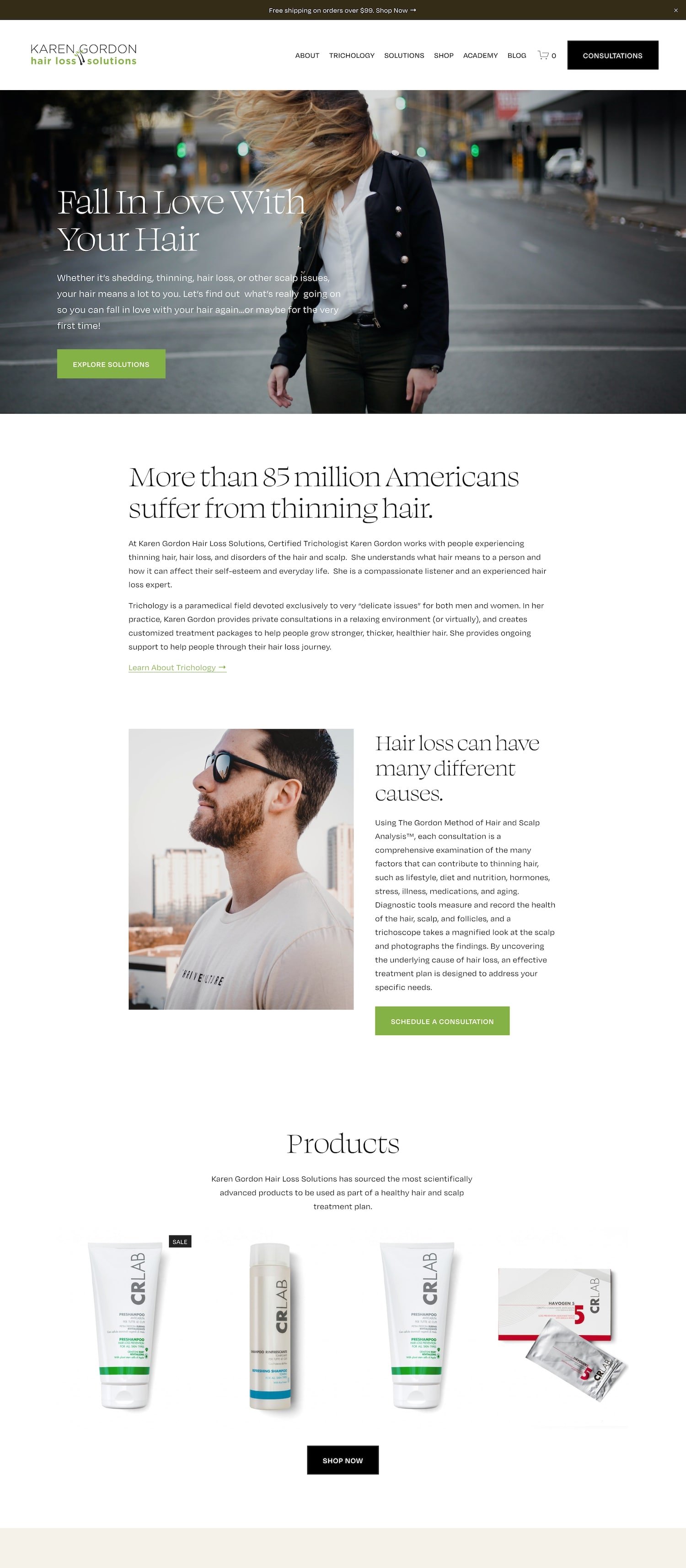
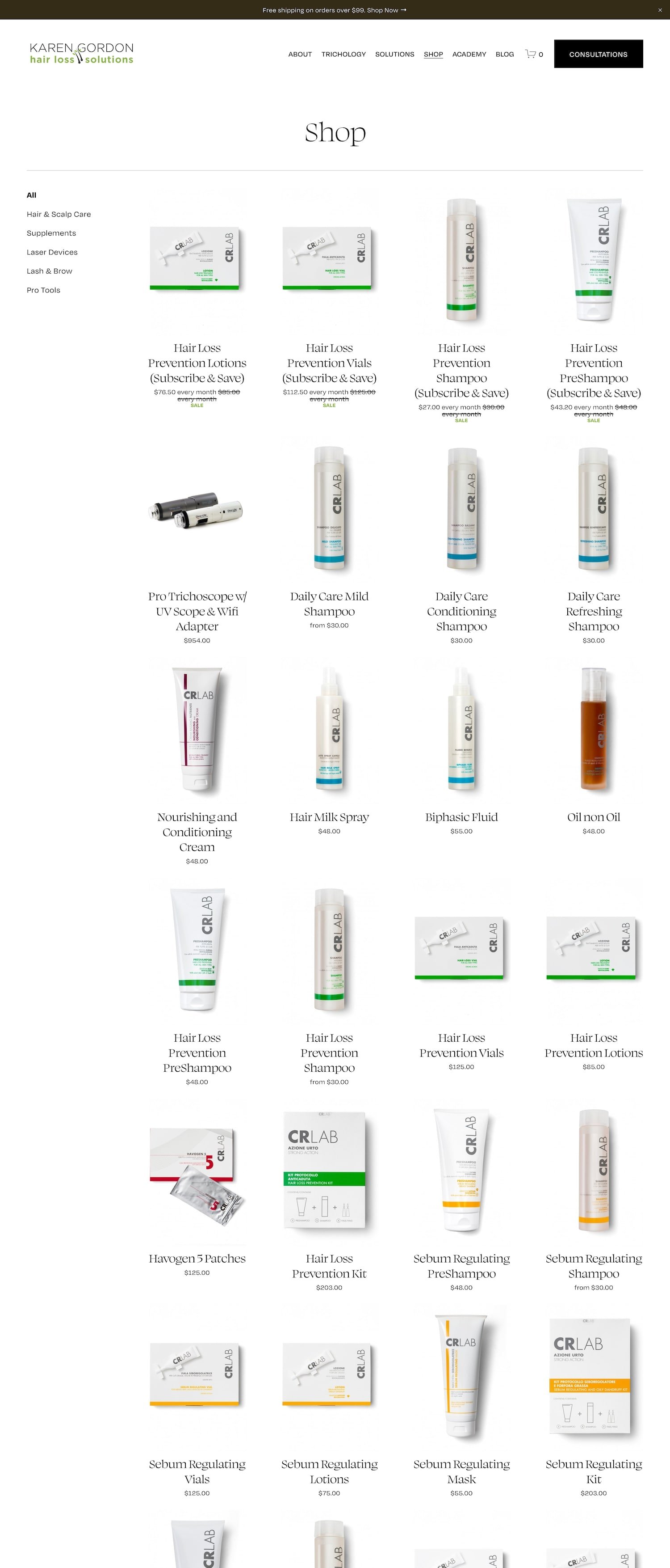
Karen Gordon Hair Loss Solutions works with individuals suffering from hair loss and hair thinning. On her website, she sells products such as shampoo, lotions, oils, and sprays to be used as part of a healthy hair + scalp treatment plan. Her website is extremely user-friendly, easy to navigate, and wonderfully articulates her mission. The overall design is mainly minimalistic which brilliantly leaves space for her product images to shine.
Favorite Features:
➡️ ISOLATED PRODUCT IMAGES. An isolated product image is so striking in my opinion. Isolating a subject is a highly effective tool used in web design to help guide viewers to important elements on the page (aka the products). Taking it a step further and adding a drop-shadow behind the product image is a great way to make the product really pop off the page.
⟡ HOW TO REPLICATE: Pop any image with a background into Canva* and use the Background Remover + Shadows tool.
➡️ AFTERPAY. Afterpay is a newish digital payment platform you’ve probably seen popping up a bunch lately. It’s allows shoppers to buy now, pay later. Users can make weekly payments on items purchased until they are paid in full. Incorporating Afterpay on your Squarespace website is a great idea as it will allow you to reach a wider audience who might prefer to make payments on your product, rather than pay upfront in full.
⟡ HOW TO REPLICATE: In your Squarespace ecommerce dashboard, go to Store Payments > Stripe > toggle on Afterpay.
#7. Katie Fischer Design
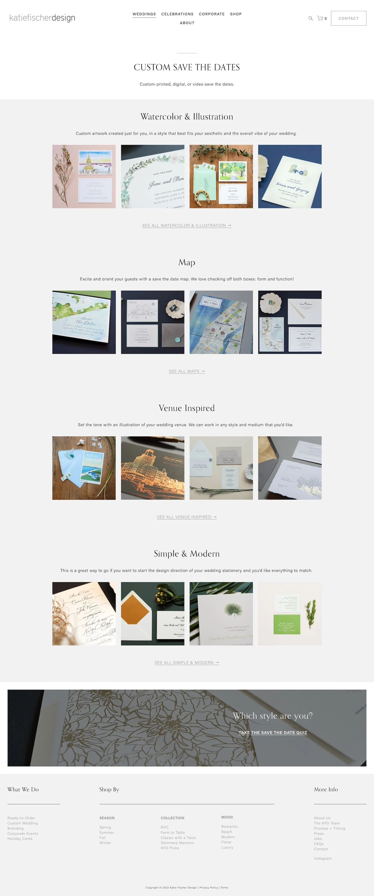
Katie Fischer sells luxury invitations, evites, stationery, and websites for weddings, galas, and events. Her website opens up with a large background video that beautifully showcases some of her products. This is a stunning first impression and leaves the visitor wanting to see more. The rest of the website consists mainly thumbnails images that you can click into to see corresponding products. This website is not very text heavy at all, which works well because she is selling custom stationary and certainly showcases images of those products very well.
Favorite Features:
➡️ MEGA MENU. The mega menu is a feature I mentioned in an example store above, however I love how this website used large images in their mega menu. It really helps the user get a feel for what they are looking at and what they need to click.
⟡ HOW TO REPLICATE: Purchase the Mega Menu plugin* from Snazzy View.
➡️ ACCORDION BLOCKS. Katie makes great use of accordion blocks on her product pages. Within these accordion blocks she is able to efficiently get across information such as how it works, timing, and pricing without overwhelming the user with too much text upfront.
⟡ HOW TO REPLICATE: Add Accordion Blocks to your product’s Additional Info.
#8. Jones Bar-B-Q
This website tastefully utilizes a bright + emotion invoking color palette which works well for their industry — food! When people are hungry, they love seeing bright, energetic colors (orange, red, yellow)… it’s scientifically proven. This website definitely capitalizes on that opportunity. Jones Bar-B-Q uses large images, large typography, and an overall loud design. It without a doubt captures the audience’s attention and leaves you wanting to click around. I recommend giving this website a look if you’re wanting to be a bold, powerhouse brand.
#9. Minna Sparkling Tea
The sparkling beverage industry has become quite saturated over the past few years. With that being said, I can image it being very difficult to stand out as a newcomer in this industry. Minna drinks does a fabulous job of being different through their unique branding and storytelling aspects of their website’s design. Their website features a bright + energetic color scheme, clean + fun fonts, and large product images that beautifully shows off their packaging. This website is great inspiration for those looking for a simplistic yet commanding design.
Favorite Features:
➡️ PURCHASE ON AMAZON. This website is a bit different from the other ecommerce examples above. It doesn’t sell products directly on their website. Instead, they link out to purchase their products on Amazon. This is a great idea as many consumers are already very comfortable and familiar with purchasing through Amazon.
⟡ HOW TO REPLICATE: Create “Order Online” buttons next to your products that link out to your Amazon listings.
#10. Soilboy Plants
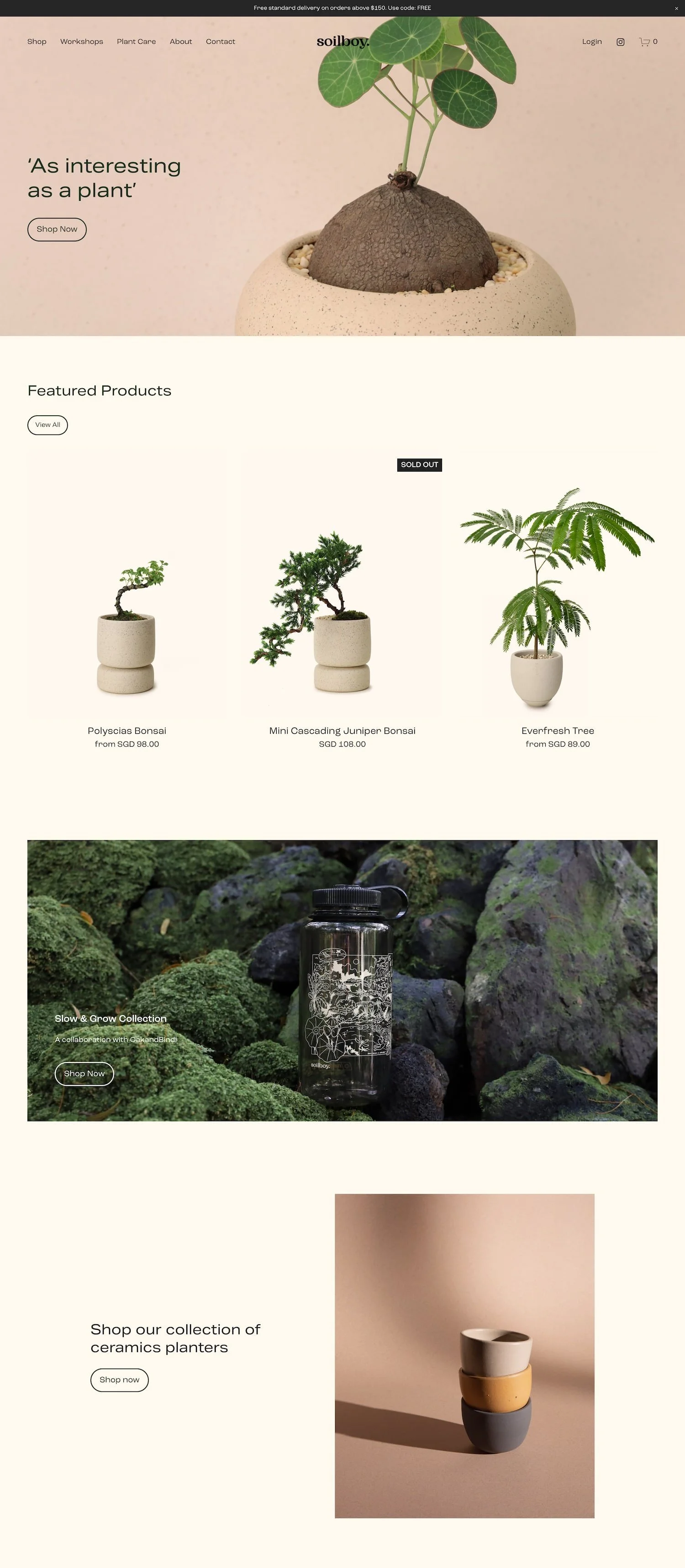
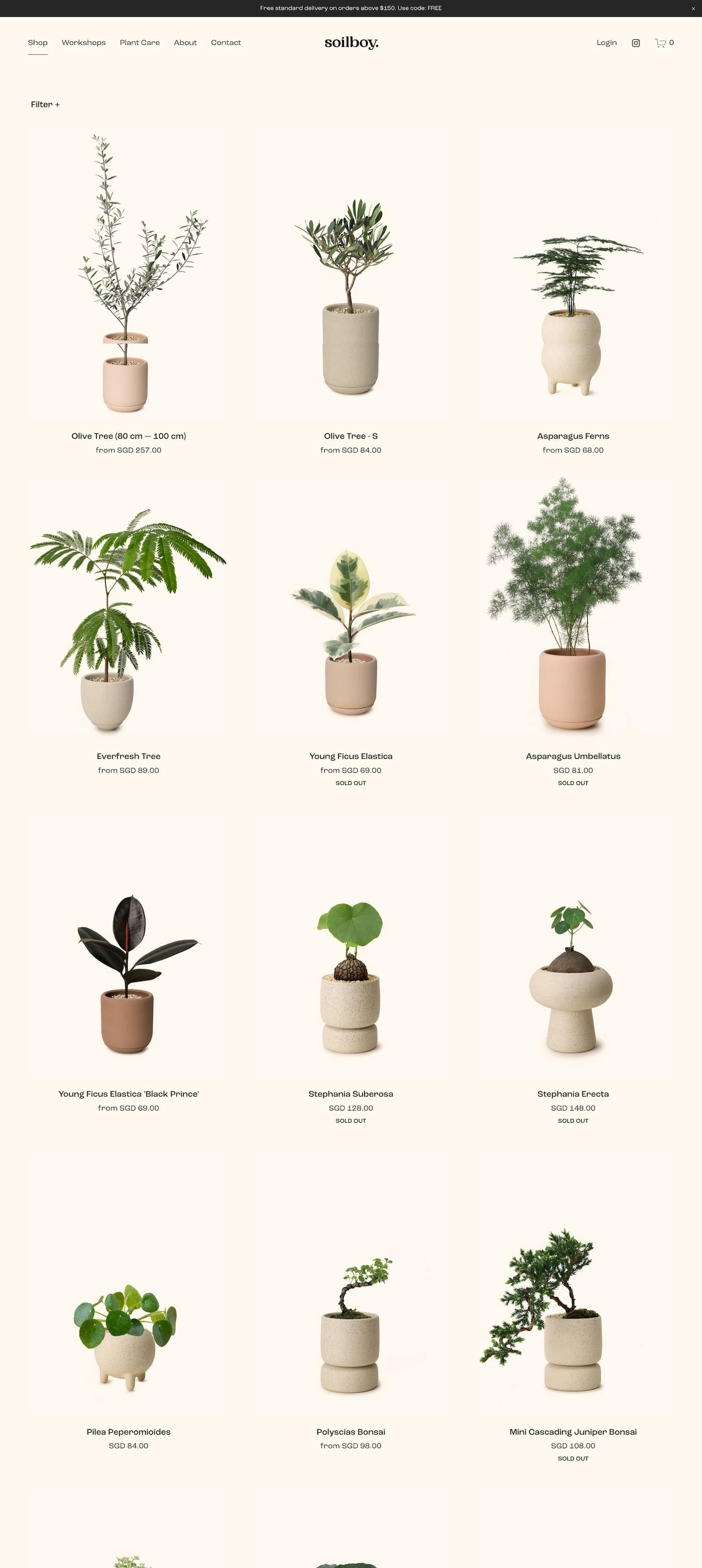
Soilboy Plants provides a simple, modern take to buying and caring for houseplants. They pride themselves on not only providing fresh, beautiful plants for their customers, but also supplying them with the tools and knowledge needed to care for their plants long-term. Their website is neutral, minimal and effortless in design, leaving room for their product images to really illuminate the pages.
Favorite Features:
➡️ GIFT CARDS. Allowing your customers to purchase gift cards on your Squarespace website is a great way to make more sales, spread the word about your products, and help someone provide a meaningful gift
⟡ HOW TO REPLICATE: When adding a new product to your store, select Gift Card. Full instructions here
#11. Artips Press-On Nails
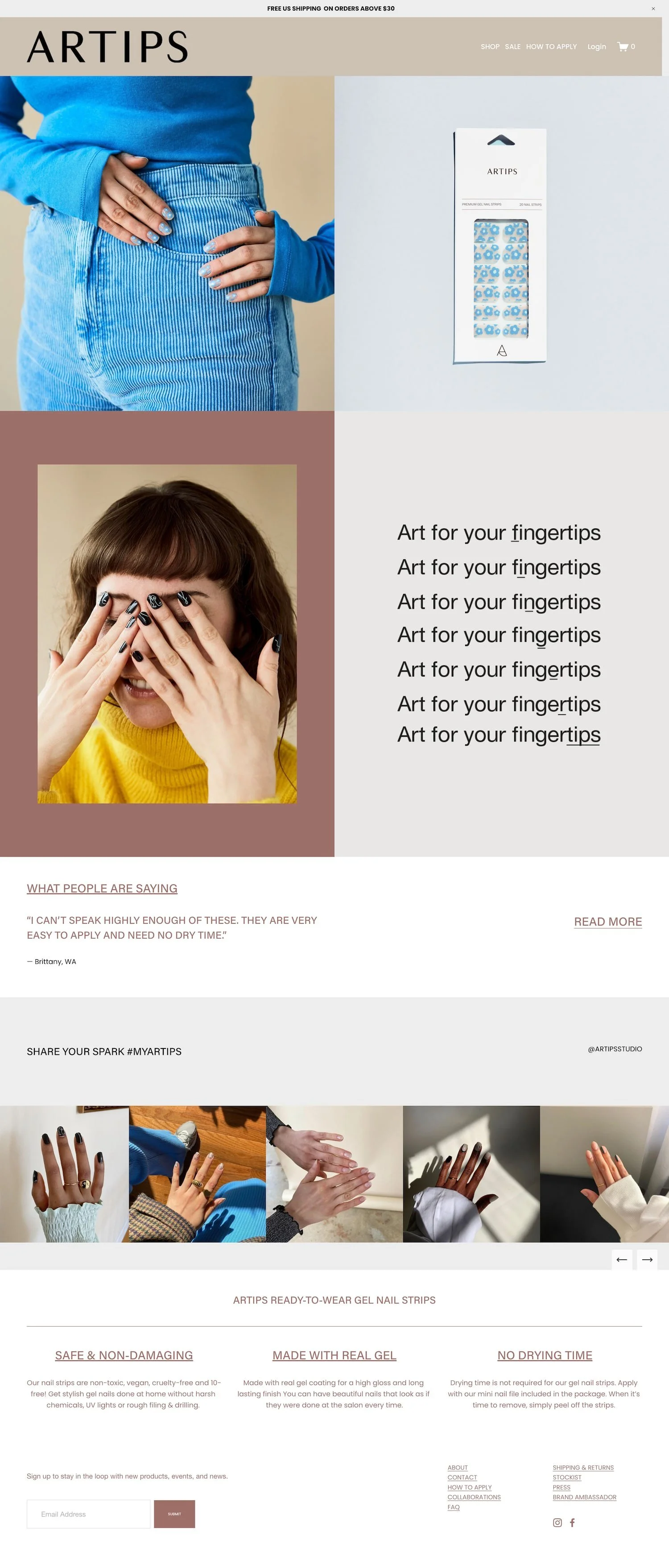
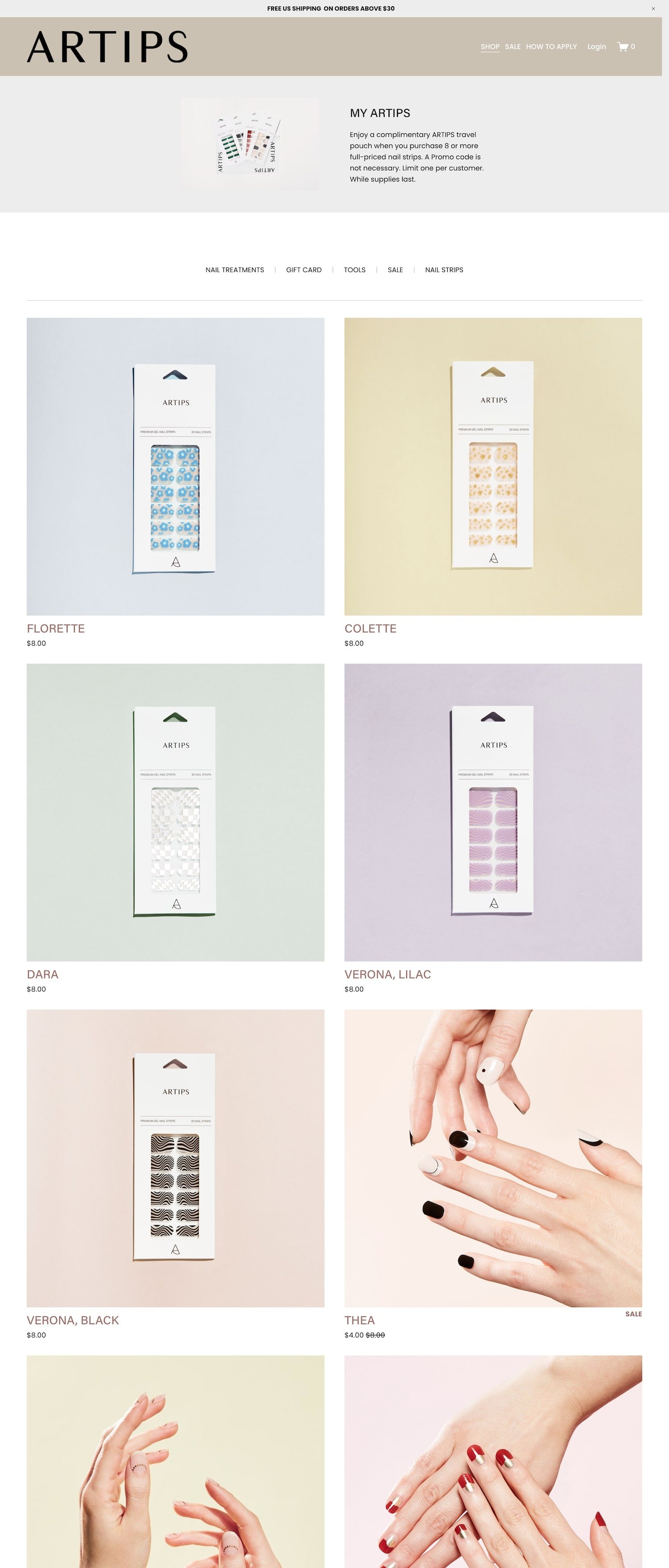
Press-on nails have made quite the splash recently. With the global pandemic and people not wanting to visit salons in-person, it really left room for this niche industry to grow. Artips certainly capitalized on this opportunity with their fun, stylish, and easy-to-apply press-on nails. They really let their product images do the talking on their website. I love how their shop page features the products in the packaging, and then when you hover over an image, you’ll see another super high-quality image of a model showing off the nails. Very striking!
Favorite Features:
➡️ ABANDONED CART RECOVERY. I must say I caved and added one of these products to my shopping cart. A few days later, I noticed I received an email saying “Your cart is waiting for you” and reminding me to finish checkout. The abandoned cart recovery feature is a great option to utilize if you run a Squarespace ecommerce shop.
⟡ HOW TO REPLICATE: Enable the feature in Checkout settings. Full instructions here.
#12. UNWRP Wrapping Paper
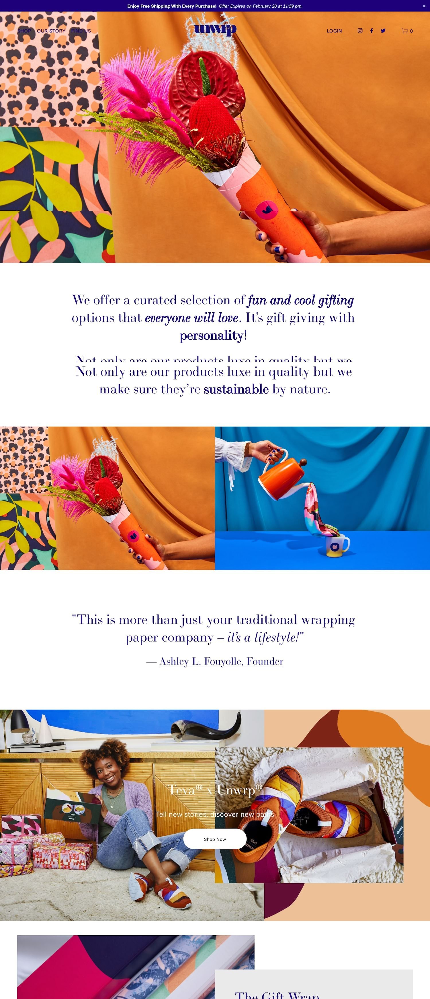
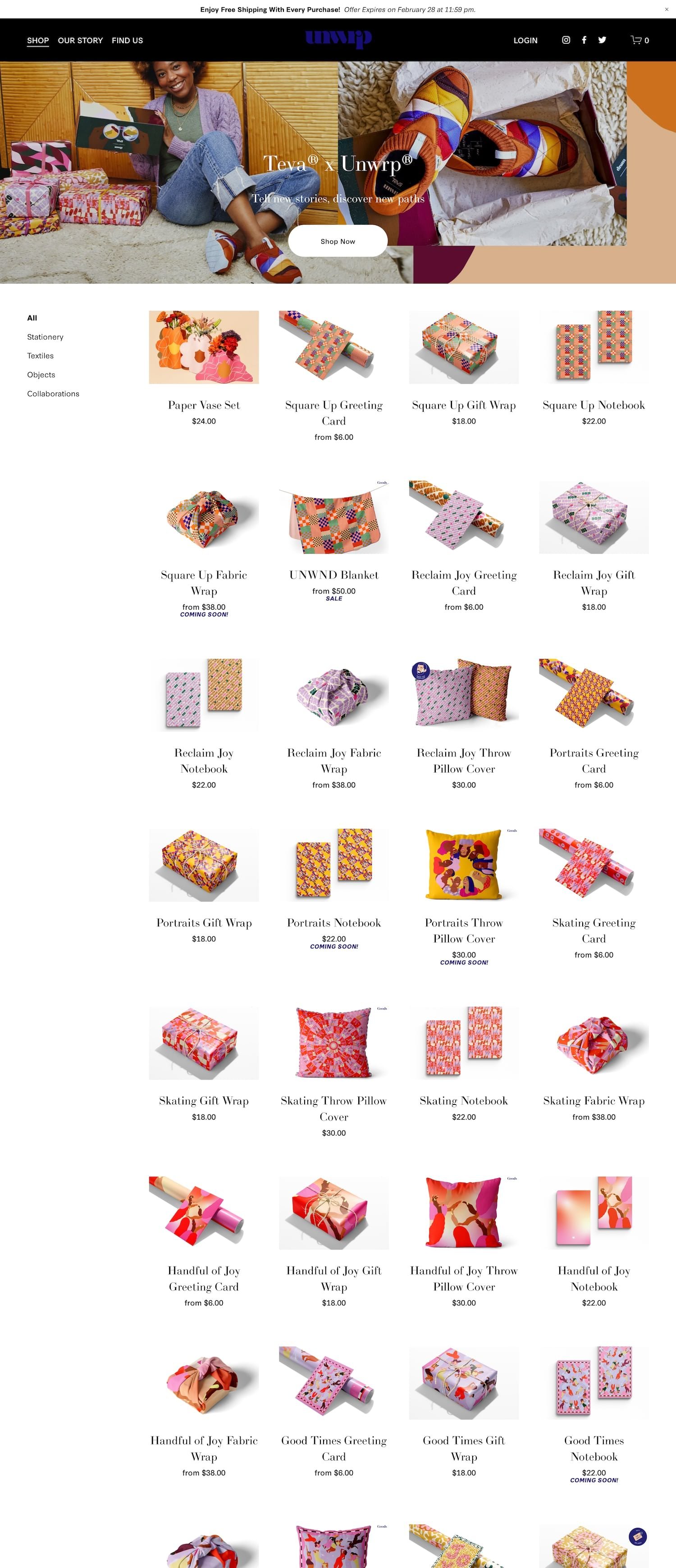
There are studies that show that wrapping and unwrapping presents actually makes people happy. So it makes sense that this website’s primary colors are purple, orange, yellow. These colors stimulate happiness and optimism. There’s certainly no shortage of serotonin on UNWRP’s website, a Squarespace ecommerce shop that sells fun and unique wrapping paper. Their bold imagery, vibrants colors and funky patterns impressively landed them to be featured on Forbes, TeenVogue, People and more. If you’re looking for artsy, fashion-driven website inspo, look no further!
#13. Blackbird Foods
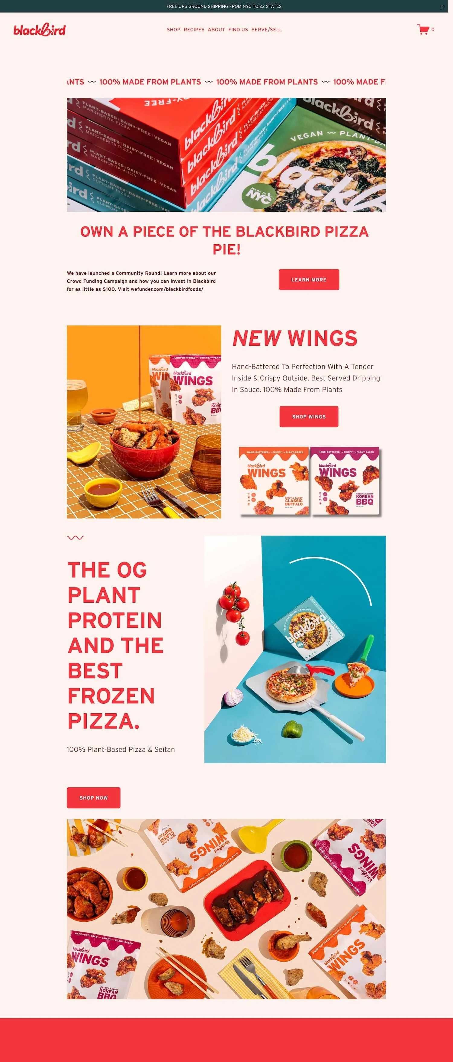
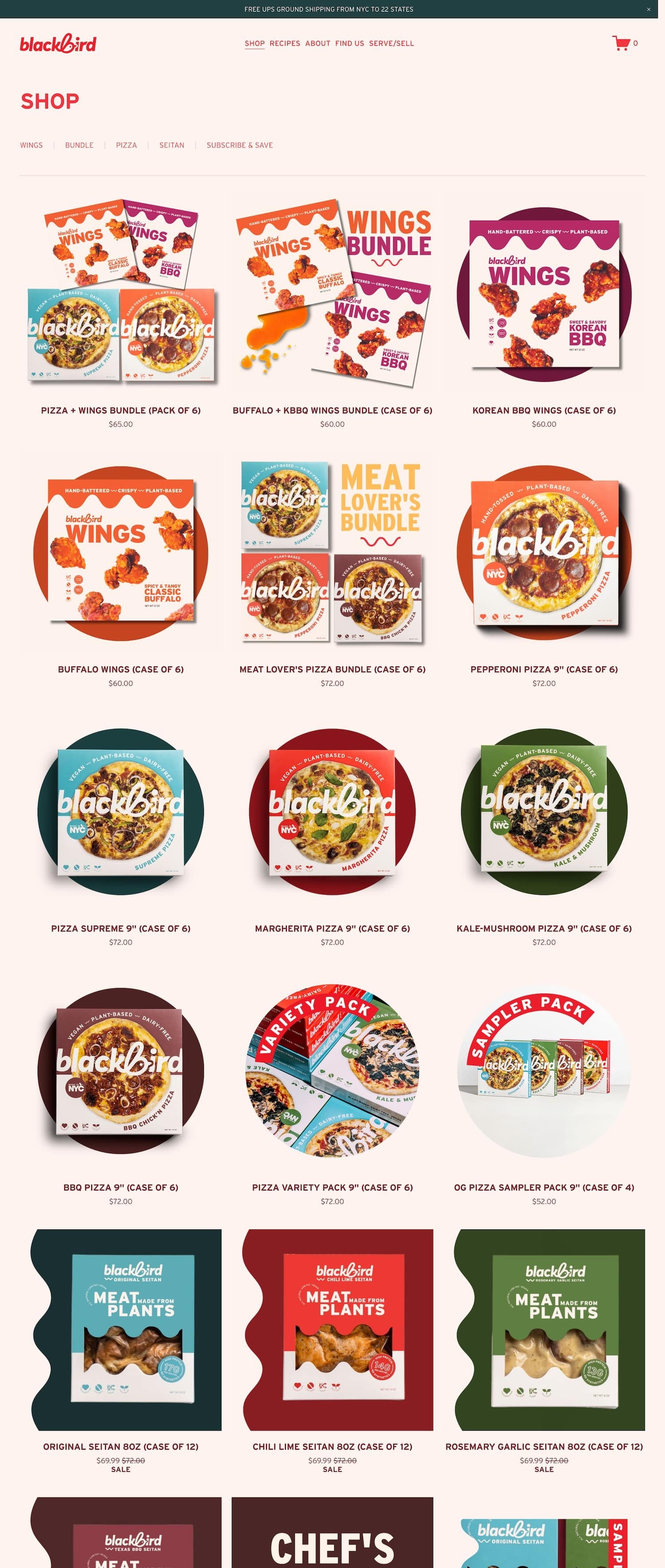
Blackbird Foods is an artisanal producer of plant-based Pizza, Seitan, and wings. The pride themselves on using only natural, non GMO ingredients that are 100% plant-based, cholesterol-free, vegan, and kosher. Their website effectively portrays that they sell good food that’s also good for you. The website is super responsive, mobile-friendly, and concise while still being fun to look at and visually engaging for visitors.
Favorite Features:
➡️ STORE LOCATOR. If you have multiple brick and mortar store locations, you should definitely incorporate a store locator on your website to help drive in local customers.
⟡ HOW TO REPLICATE: Integrate Mapbox’s Store Locator or Storepoint’s Store Locator onto your website
➡️ REFERRAL PROGRAM. In the bottom right corner of this website, you’ll see a floating box that says “GET $10 OFF YOUR NEXT ORDER!”. If you click on that, you’ll be guided to a referral program that allows you to share a link with a friend in return for $10 off your order for you and your friend.
⟡ HOW TO REPLICATE: Peach’s Squarespace Referral Program* is the #1 refer-a-friend software for Squarespace eCommerce stores and is super easy to set up
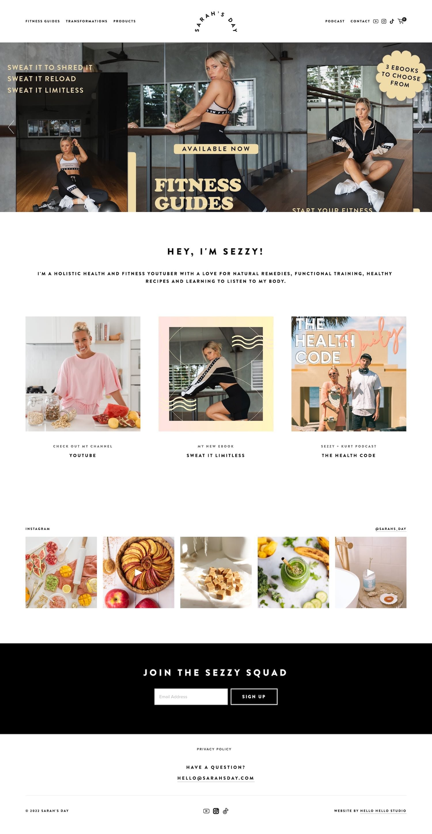
#14. Sarah's Day Fitness
Sarah’s Day Fitness sells fitness guides on her simple yet beautiful website. In addition to her main shop page, she has a “products” page which contains portals to external products (such as apps, ebooks, and fitness programs). I love the style on this website as it’s clean and modern but still bright and vibrant.
Favorite Features:
➡️ DEVICE PRODUCT MOCKUPS. I love how Sarah has placed the images of her fitness products inside tablets on her main shop page. It gives the illusion that you are purchasing a tech-forward product!
⟡ HOW TO REPLICATE: Utilize device mockups in Canva* or Smart Mockups.
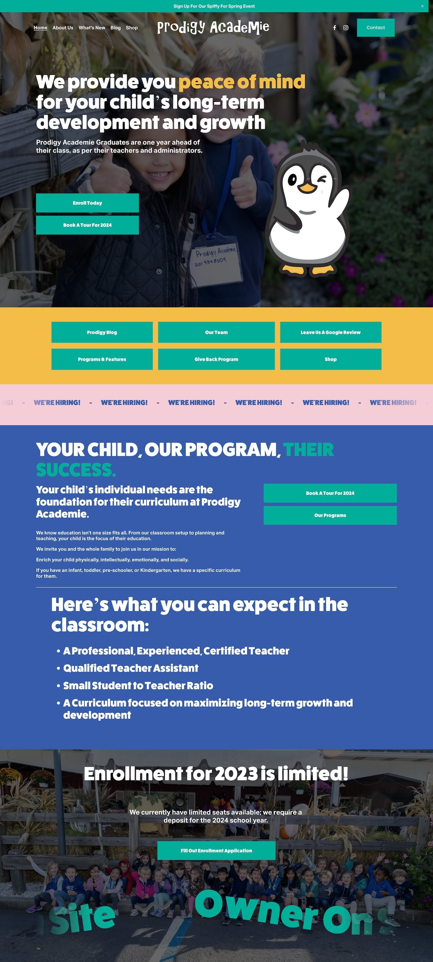
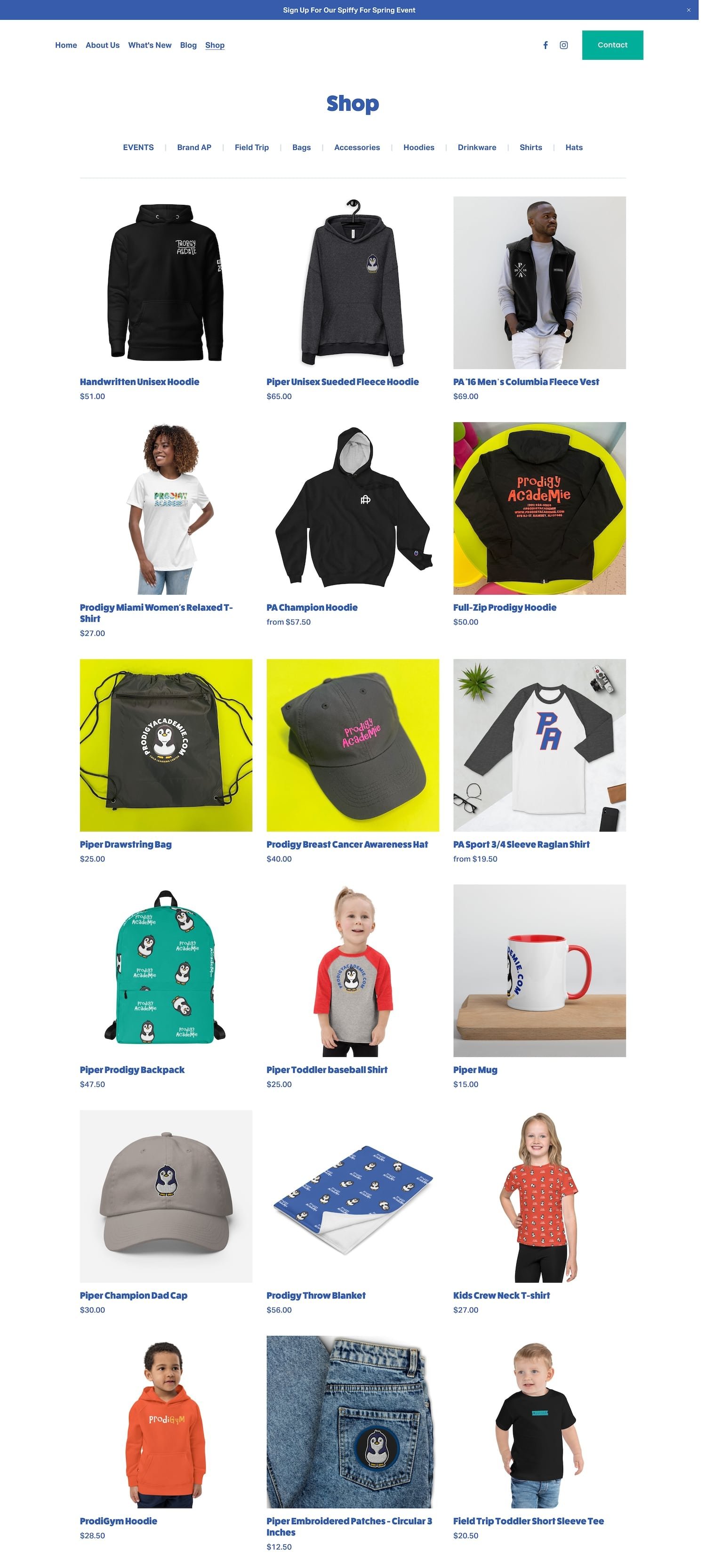
#15. Prodigy Academie
Prodigy Academie primarily focuses on children’s developmental growth programs. However, their website contains a small ecommerce shop where they sell some of their merch. Their site utilizes wonderful, kid-friendly colors and typography which fits their mission well. I love the little penguin animation on their homepage! It gives off a super friendly, approachable vibe.
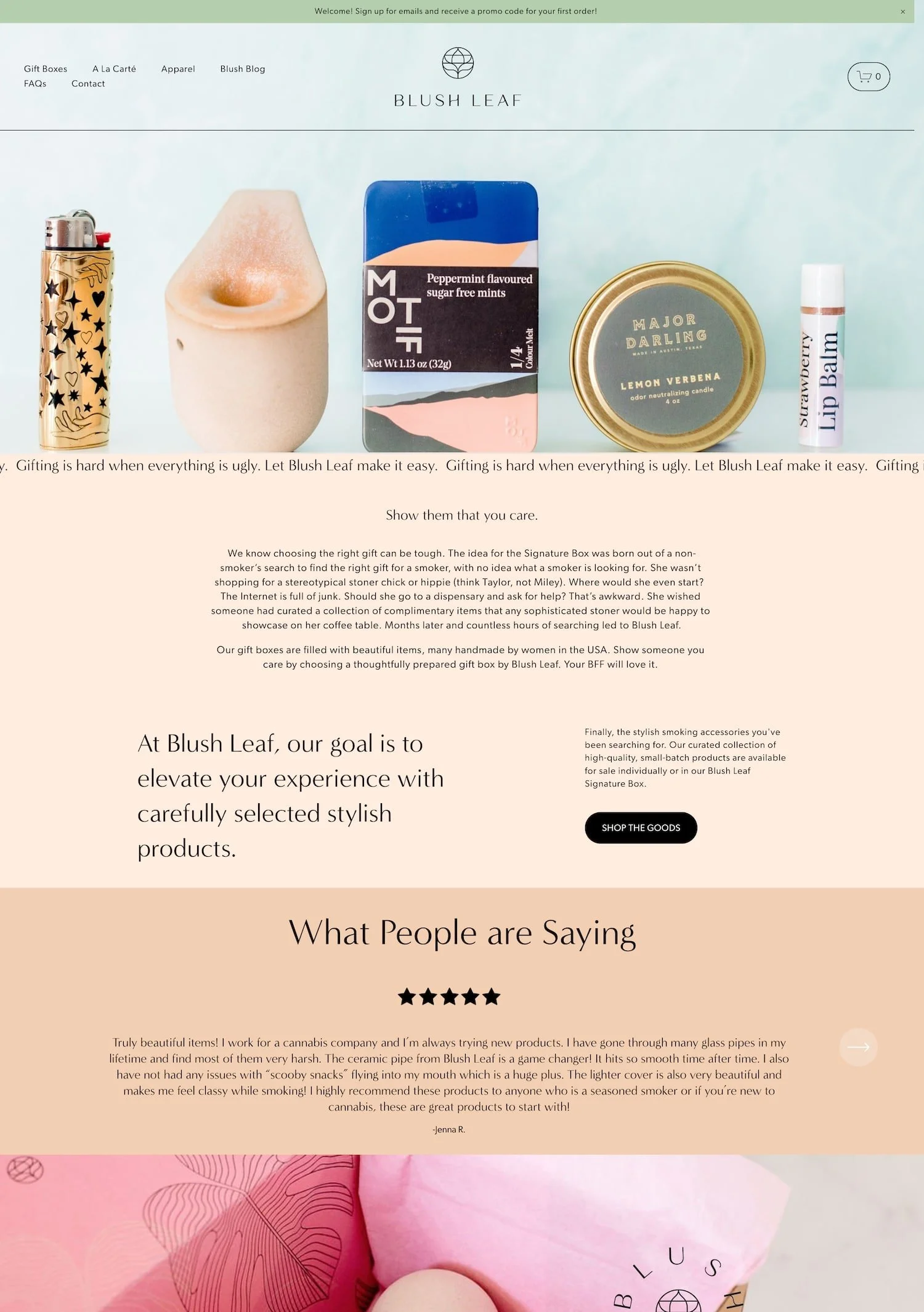
#16. Blush Leaf Shop
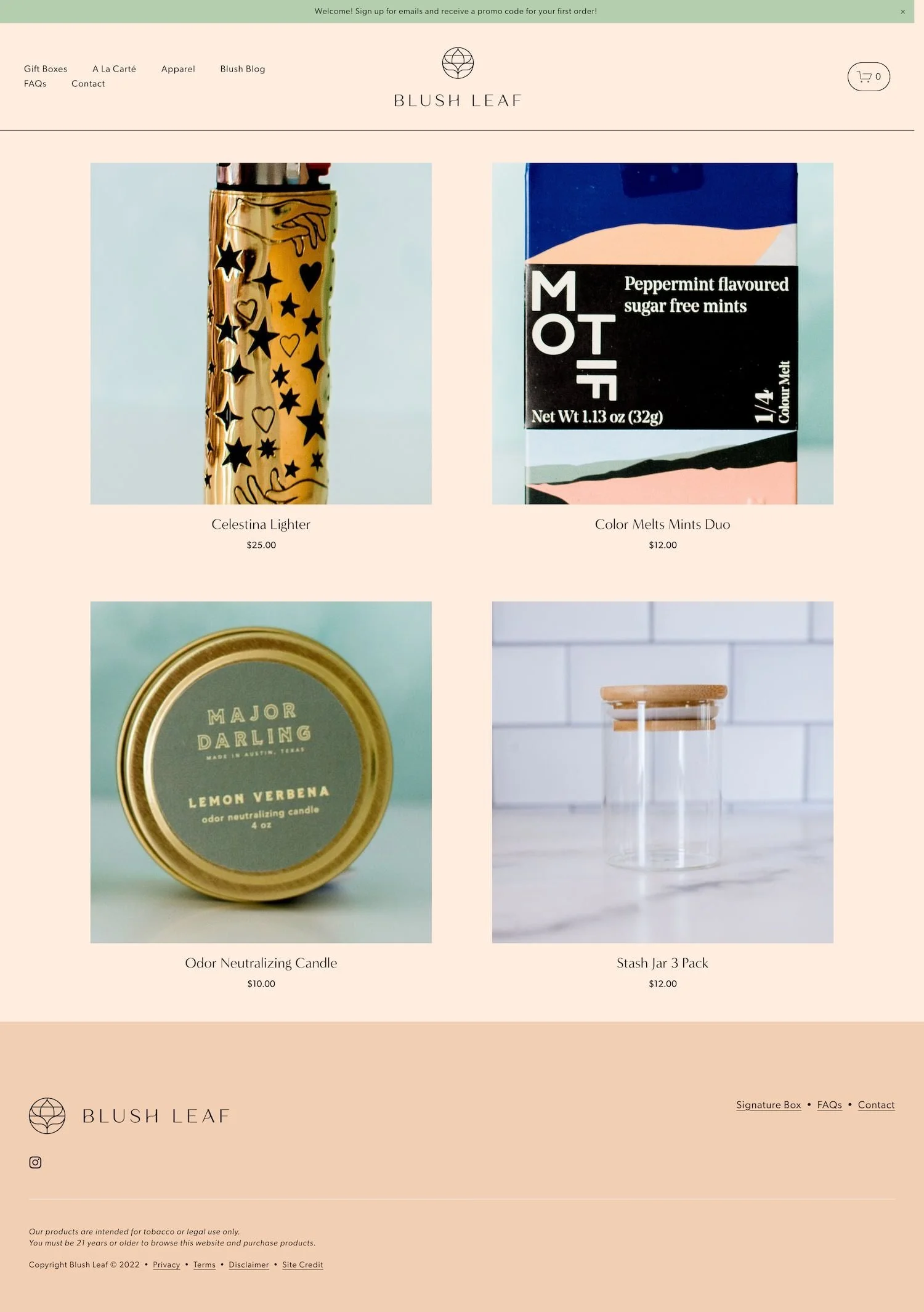
Blush Leaf Shop sells ceramic pipes and cute smoking accessories on their neutral yet stylish Squarespace website. Their homepage opens up with a large banner image containing a nice looking product lineup. This helps the user visualize exactly what they might find while shopping on this website. This shop sells a few different types of items ranging from a la carté products to apparel to gift boxes. Blush Leaf Shop is a great inspiration website if you’re looking for something that’s clean and minimal without being strikingly white. Their color scheme is a perfect blend of creamy, warm, and inviting!
Favorite Features:
➡️ PRODUCT REVIEWS. Displaying customer reviews on your website can not only help boost sales, but can also help increase customer satisfaction and loyalty. This is because potential customers can see that you value customer feedback and are committed to providing a great experience.
⟡ HOW TO REPLICATE: Enable product reviews in your website settings or integrate a more robust, 3rd party platform such as Wiremo*.
#17. The North Coal
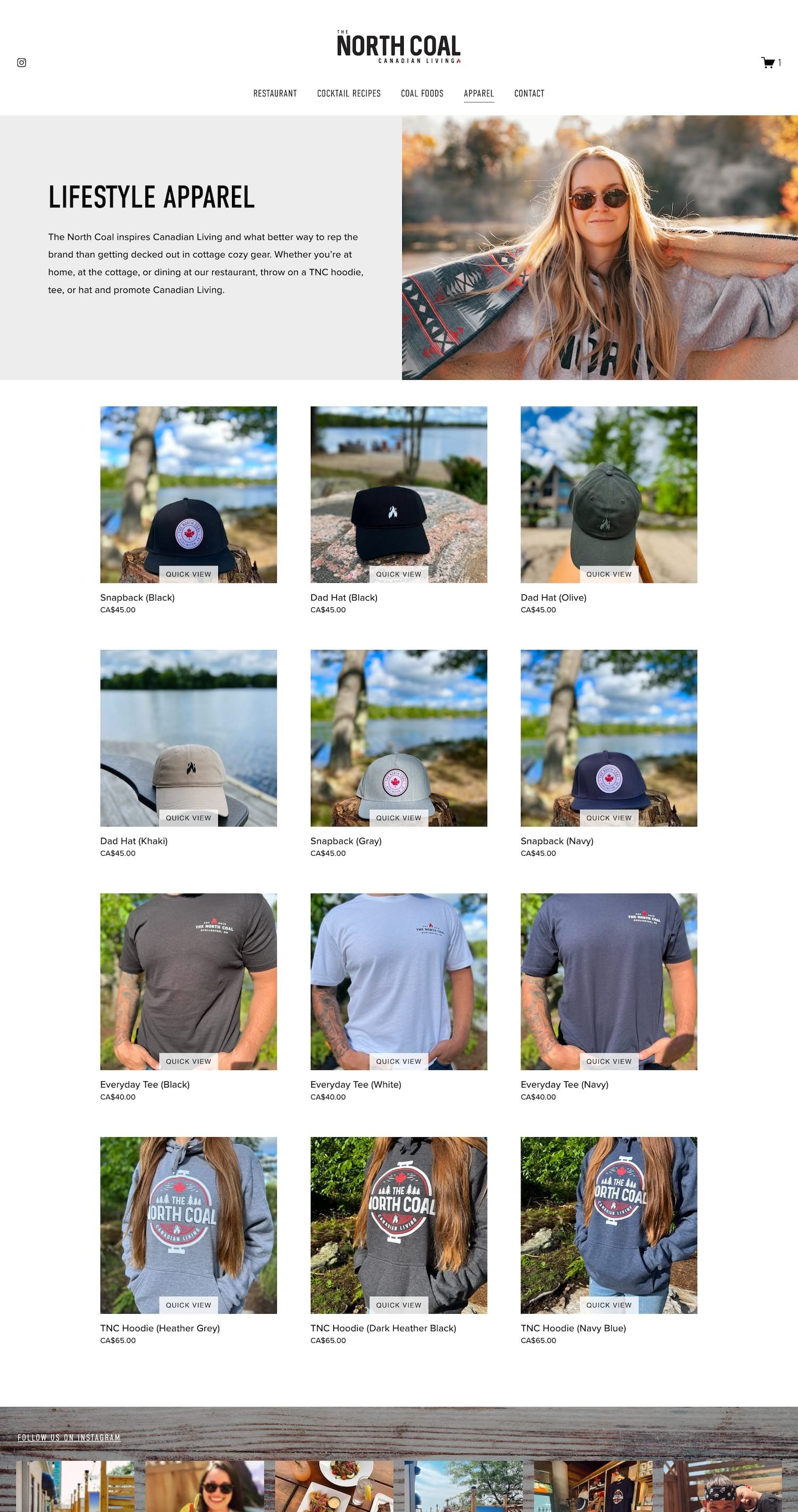
The North Coal is a Canadian company that focuses on bringing a little bit of nature into city living. They have a physical restaurant location in Burlington, ON but they also sell proprietary goods and lifestyle apparel on their Squarespace site. Their website gets people involved by integrating their Instagram account to show off people eating at the restaurant and enjoying their products/ wearing their apparel. They showcase some of their favorite cocktail recipes on the site which cleverly includes some of the ingredients they sell. This is a great way to market some of their products!
#18. Little Clay Land
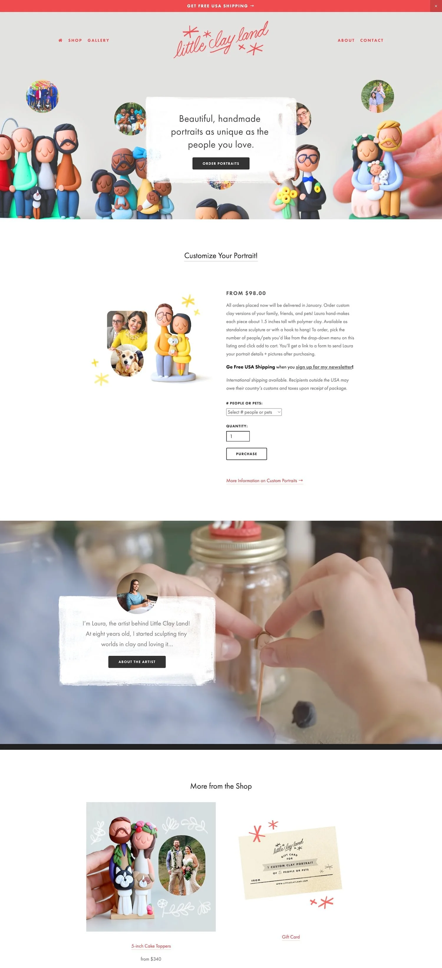
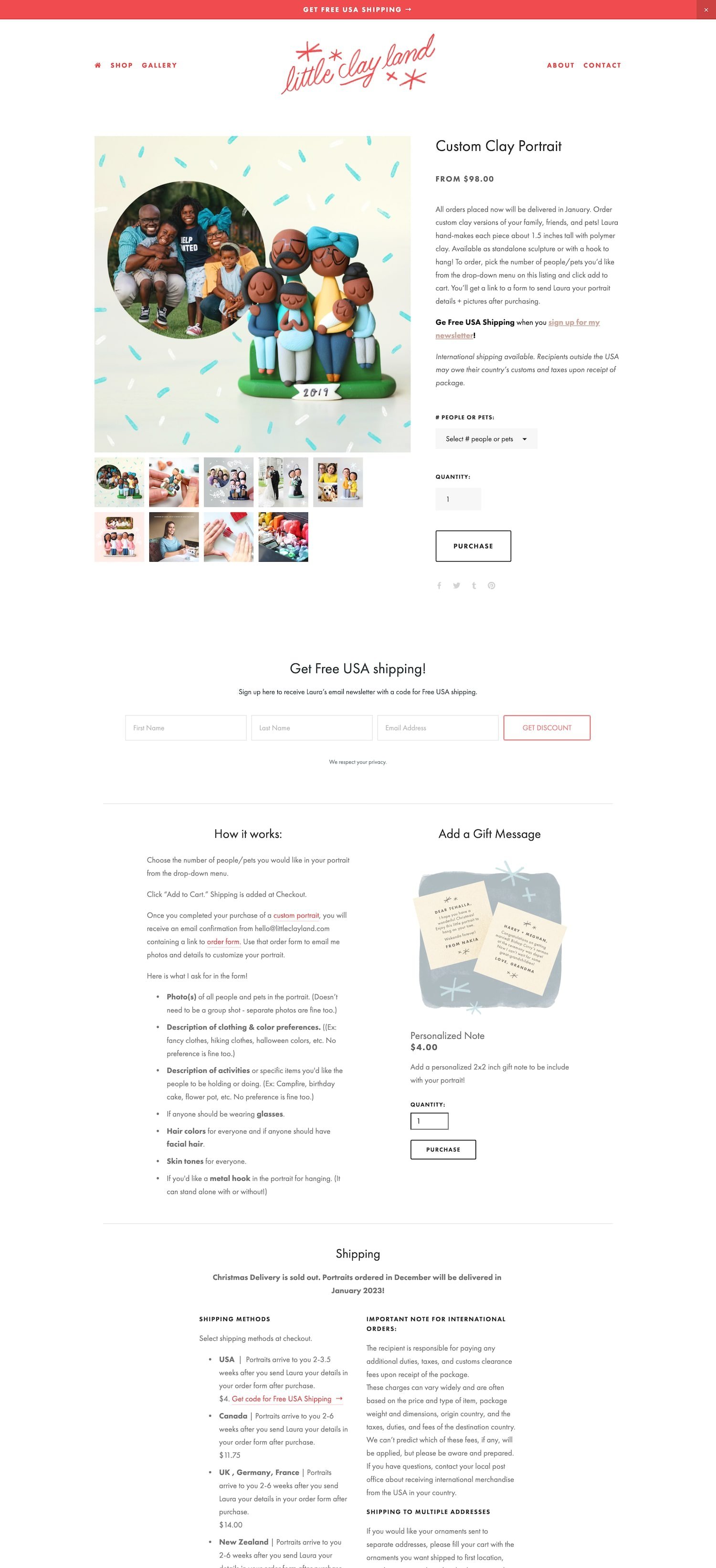
Little Clay Land sells beautiful, handmade clay figures. This is a super unique gift idea! About halfway down the homepage, you’ll find a large background video of Laura (artist and owner of Little Clay Land) designing and building one of her figures. I think this video adds such a personal touch and really conveys the concept that each gift is handmade with love. Each product page contains ample images, details, and specifications which I can imagine really helps reduce the amount of customer questions. If you’re looking for a super cute web design that makes great use of Squarespace’s ecommerce features, I would definitely check this one out.
Favorite Features:
➡️ EXPRESS CHECKOUT. Express checkout directs customers to a checkout page after clicking a product rather than adding it to a shopping cart. This is a great option for stores who want to simplify the checkout process and reduce cart abandonment.
⟡ HOW TO REPLICATE: Enable Express Checkout in your Squarespace website settings.
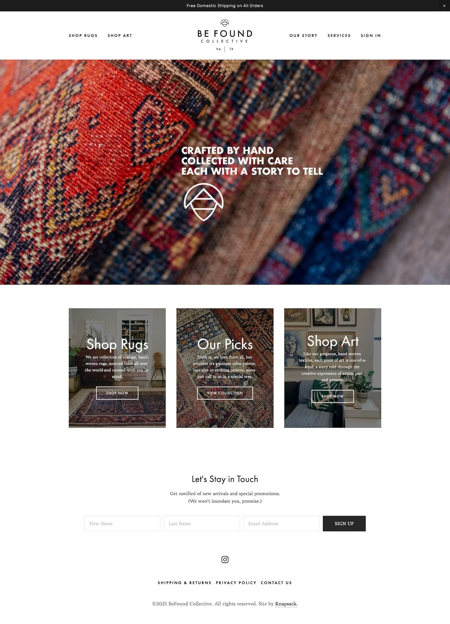
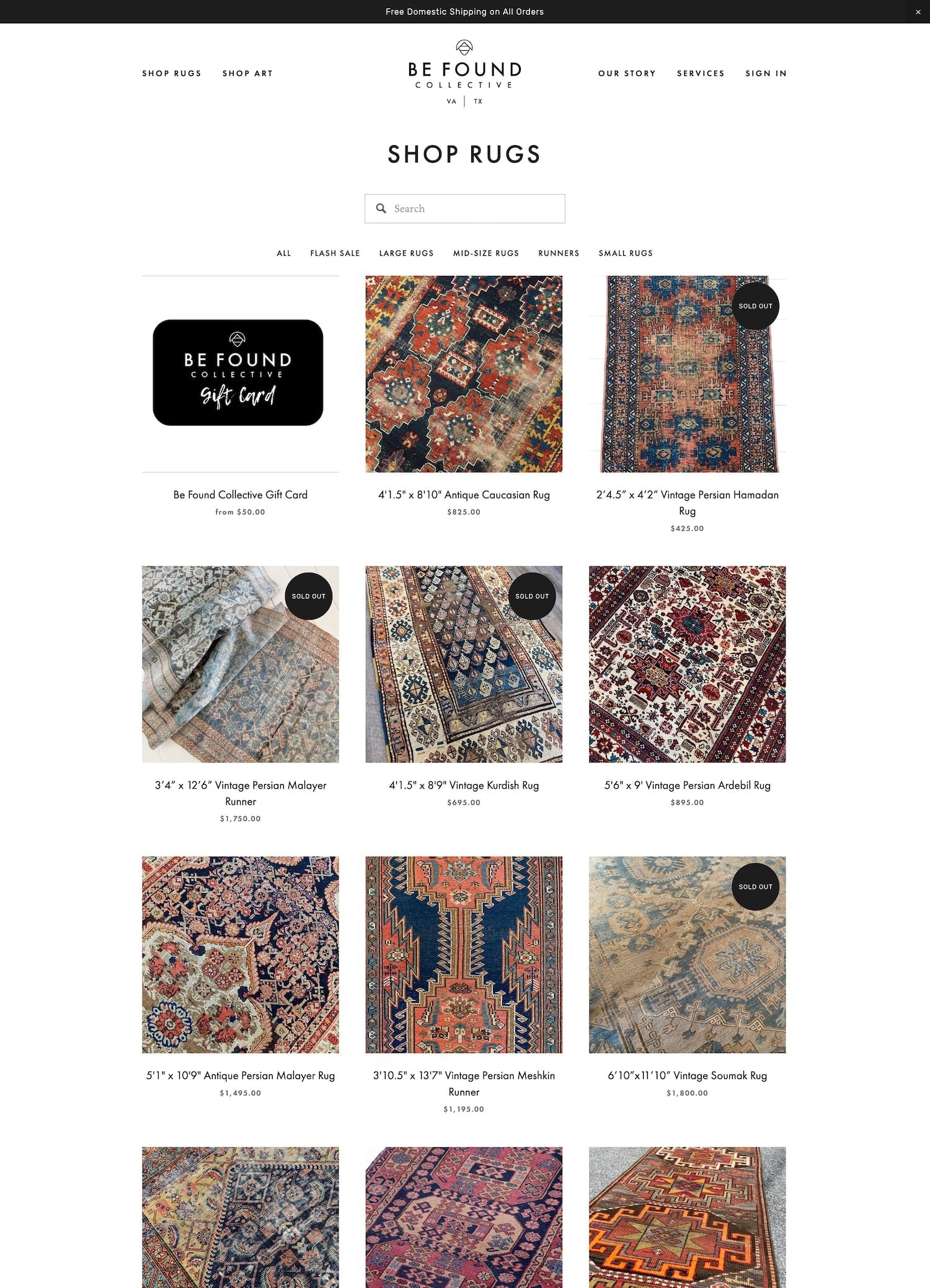
#19. BeFound Collective
BeFound Collective sells unique handwoven rugs on their Squarespace website. In addition to selling rugs, they also offer rug repair services to help repair and reinforce worn and distressed rugs. This is a great idea as they are able to appeal to a few different markets here (those who are seeking vintage rugs and those who need help with their current vintage rugs). Their website is simple with a black and white, modern style. However, this really helps their product images capture your attention and become the centerpiece and main focus.
Favorite Features:
➡️ SORT AND FILTER PRODUCTS. This website allows customers to sort and filter products to help them easily sift through products and help them find what they are looking for.
⟡ HOW TO REPLICATE: Purchase the Universal Filter Plugin* from Squarewebsites.
#20. Your Social Team
A majority of this list has consisted of physical product shops. Let’s pivot a bit and show some love to digital products too! Your Social Team sells Canva* templates for social media managers and entrepreneurs. This is one of the most lively website designs on this list which certainly makes me want to purchase something from their shop. This website has no shortage of engaging graphics, sparkling designs, and overall energetic vibes.
Favorite Features:
➡️ SELLING ON KAJABI. Instead of selling templates directly from their website, they actually link out to Kajabi which I can imagine gives them some extra functionally and features for their shop.
⟡ HOW TO REPLICATE: Set up products on Kajabi and link to them from your Squarespace website pages. Another similar option that I see a lot of Squarespace customers using (and that I personally use myself!) is ThriveCart* which is a fantastic platform for selling digital products and courses.
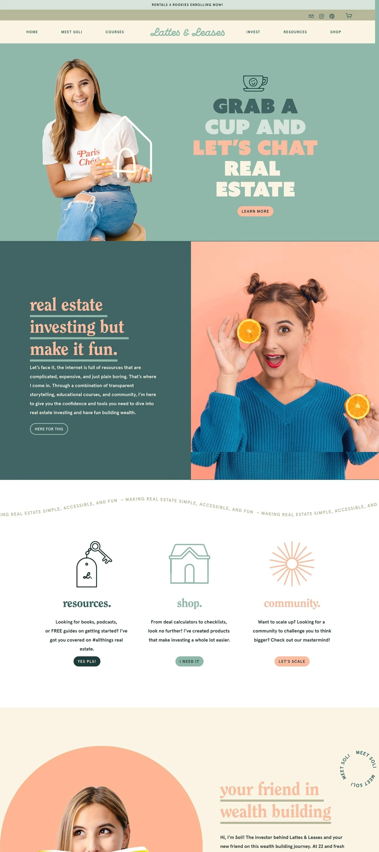
#21. Lattes & Leases
Another fun digital product shop to add to this list is Lattes & Leases. This company teaches real estate investing but tries to make it fun, relatable, and achievable for everyone. Their website has many custom graphics and GIFs which helps make it engaging and further conveys that they are here to make real estate investing less boring. This website is bright + vibrant while still being neutral + calming which is hard to do, so kudos to them!
Favorite Features:
➡️ SPLIT SCREEN LAYOUT DESIGN. I absolutely love how this website incorpates such large, fun images. Throughout the website, you’ll continually see the use of a split screen layout which showcases a large image on one side and a block of text on the other, taking up the whole screen and really making a powerful presentation.
⟡ HOW TO REPLICATE: Purchase the Split Screen Layout Design Pack* from Will Myers.
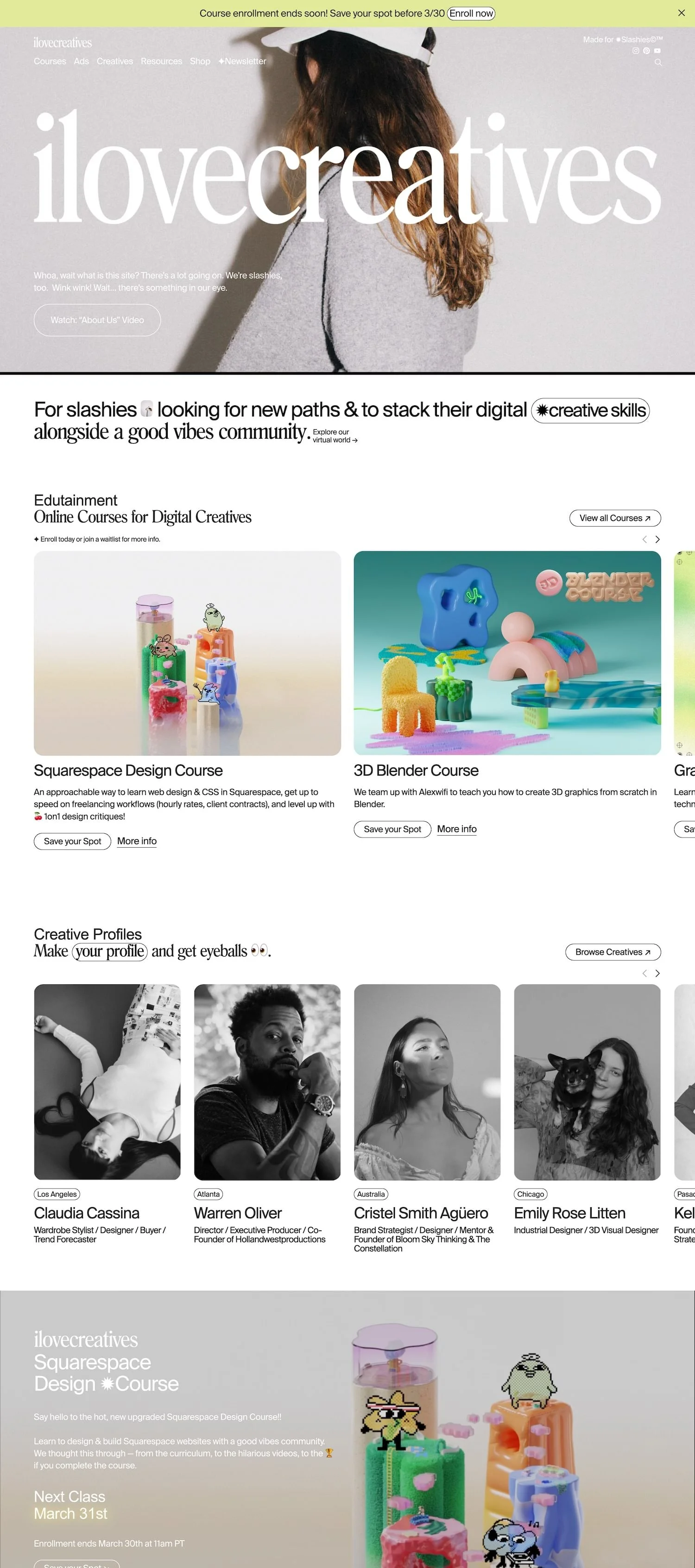
#22. iLoveCreatives Studio
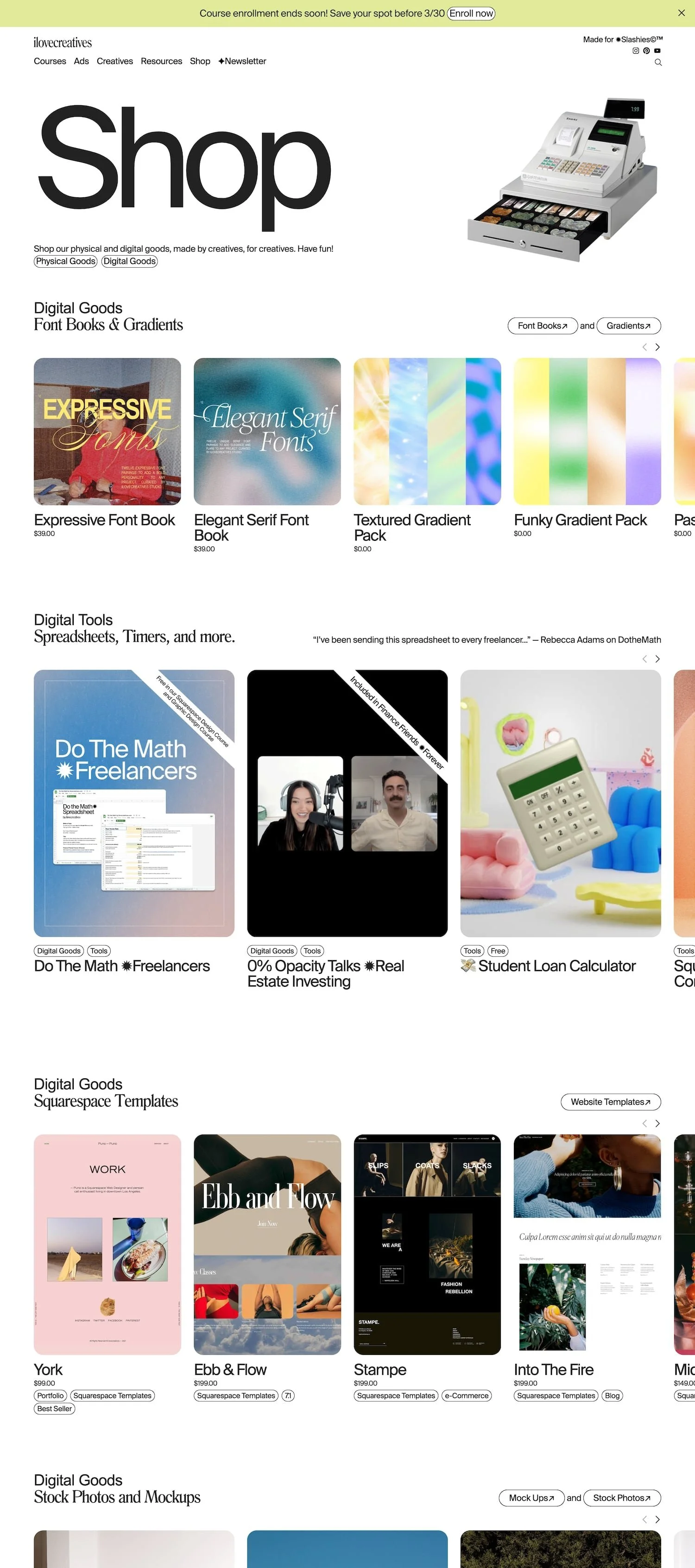
If you need some inspiration from an ultra modern, trendy ecommerce shop on Squarespace, definitely take some notes from iLoveCreatives. These guys sell courses for basically any type of creative freelancer, digital products such as website templates, mockups, and code snippets and even some physical products such as planners and candles that incorporate their own personal branding.
#23. H2O Tank Avenue
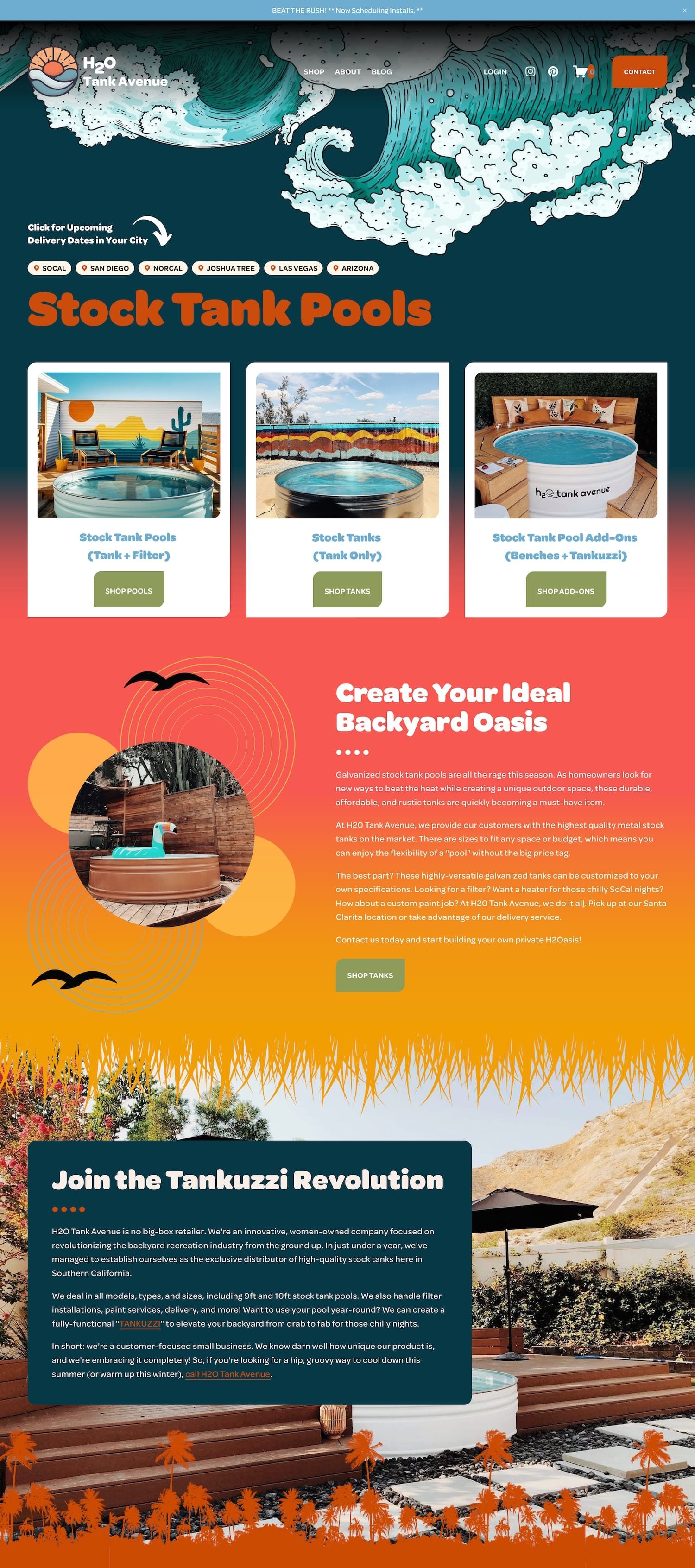
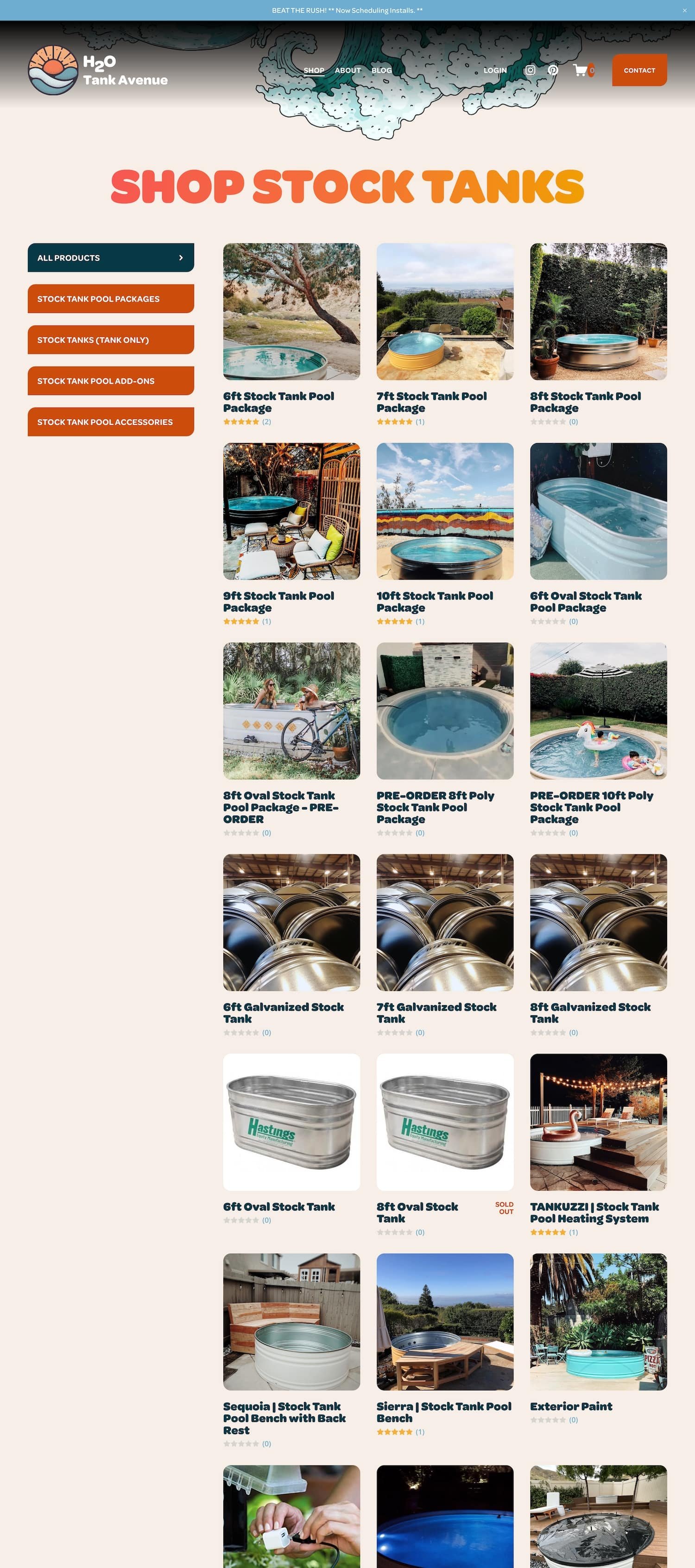
I couldn’t complete this list without including some websites I’ve designed 😊 . H2O Tank Avenue is one of the funkiest designs I’ve ever created with Squarespace (by request of my client!). The large bubbly fonts combined with the jazzy colors and vivacious graphics really makes for quite the memorable experience. This website made a big splash after we launched, really impressed their customers, and continues to make great sales! It’s definitely worth taking a look at if you’re looking for some unique design inspiration.
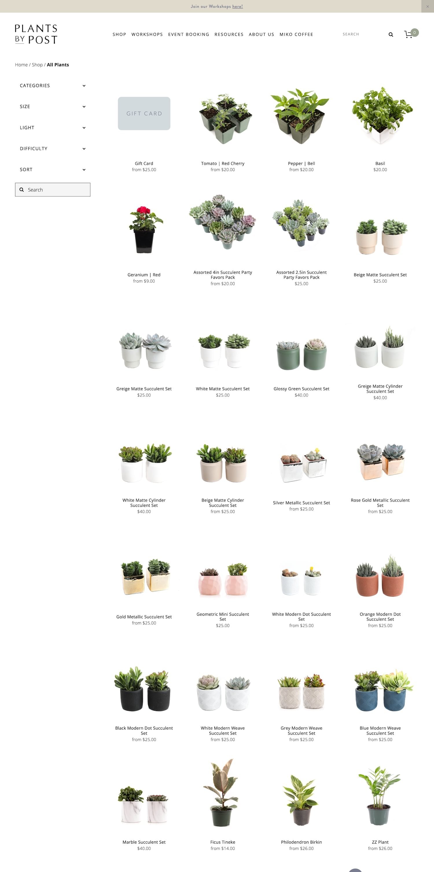
#24. Plants by Post
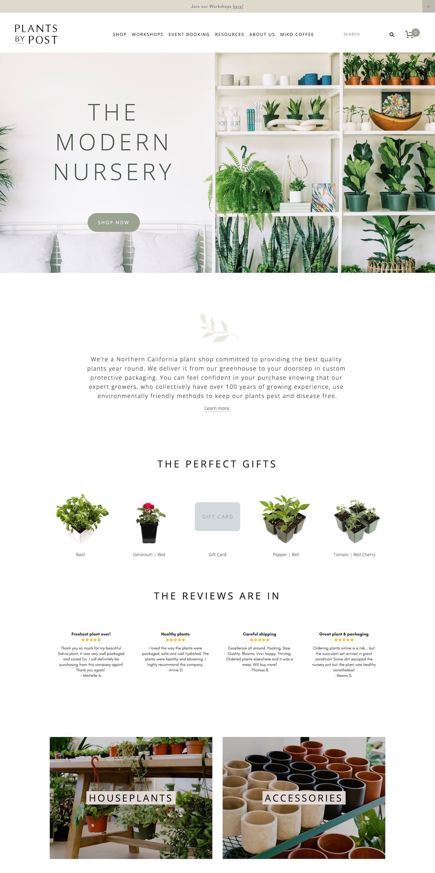
This website really understands the “less is more” principle in web design. I love how they let their plants do the speaking while the effortless fonts and muted color scheme sort of take a back seat. While the design is pretty basic, it still feels warm and inviting and makes me feel as if I’m walking into some sort of elegant greenhouse.
➡️ PRODUCT CATEGORY DROPDOWNS. I actually had a hand in helping this website create the product category dropdowns you’ll see on the main shop page. Their large selection of plants and various product variations really called for this robust functionality that allows their customers to easily sort and filter through their products.
⟡ HOW TO REPLICATE: Purchase the Universal Filter Plugin* from Squarewebsites.
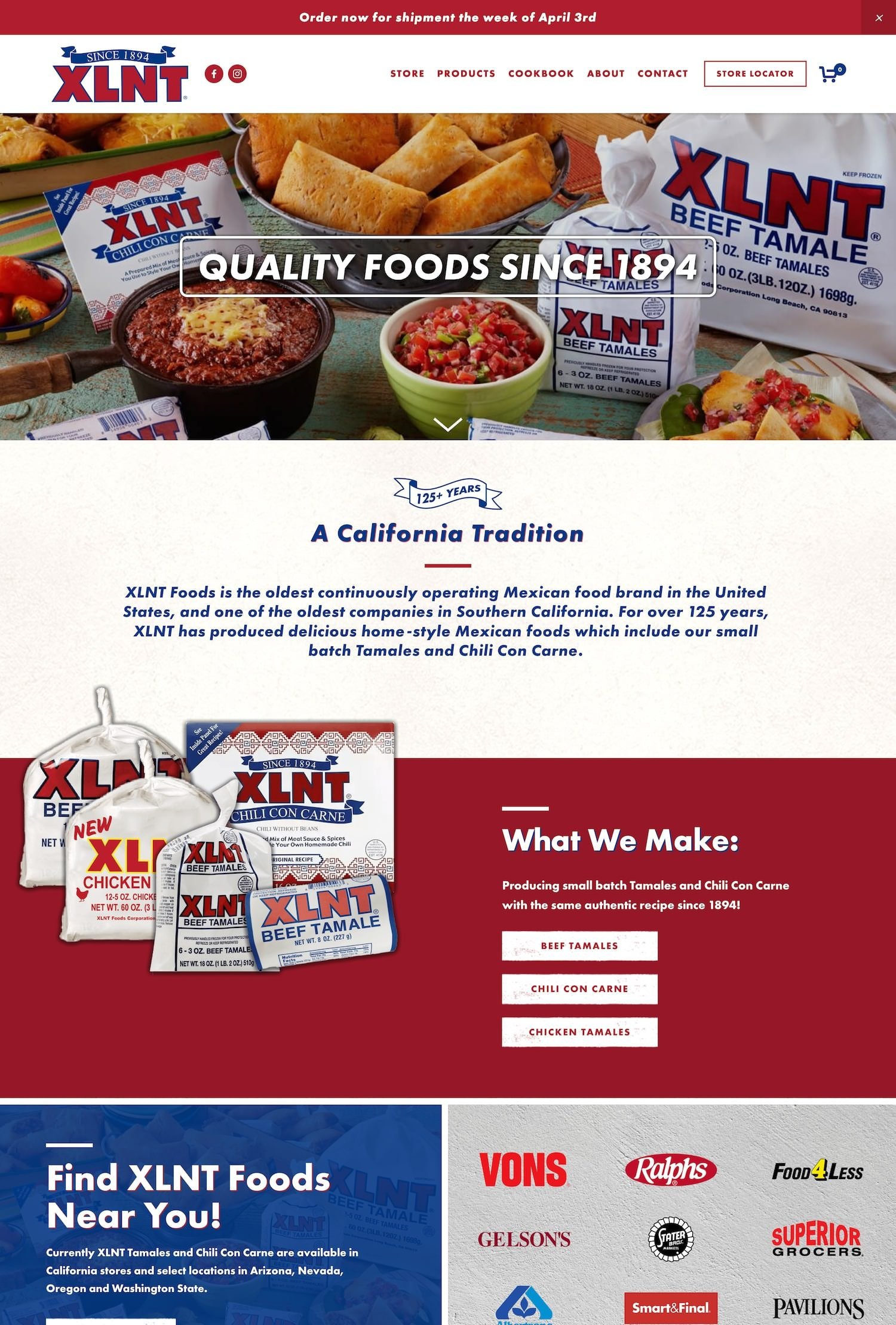
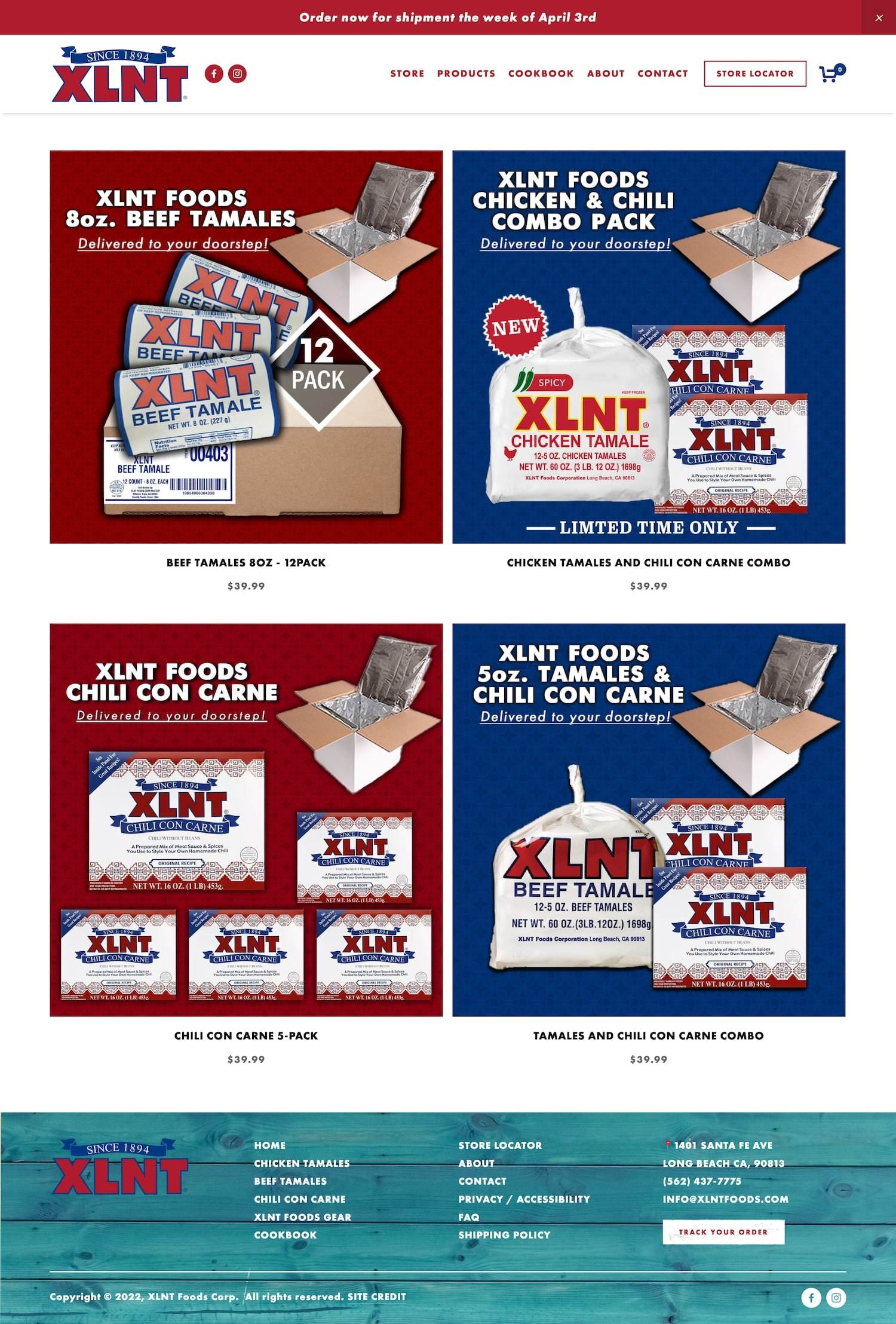
#25. XLNT Foods
XLNT Foods is another unique Squarespace ecommerce site I helped create a few years ago. XLNT sells tamales and chili con carne on their website (along with some fun apparel). They’ve been in business since 1894 and their tamales are actually a staple item in Southern California grocery stores, easily recognized on the shelf by the red, white and blue packaging. So of course we had to integrate this same red, white, and blue color scheme into the website to help customers easily recognize the site and the brand.
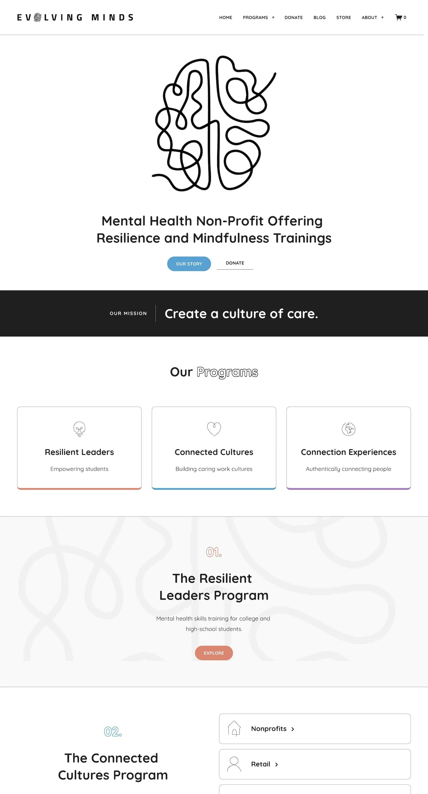
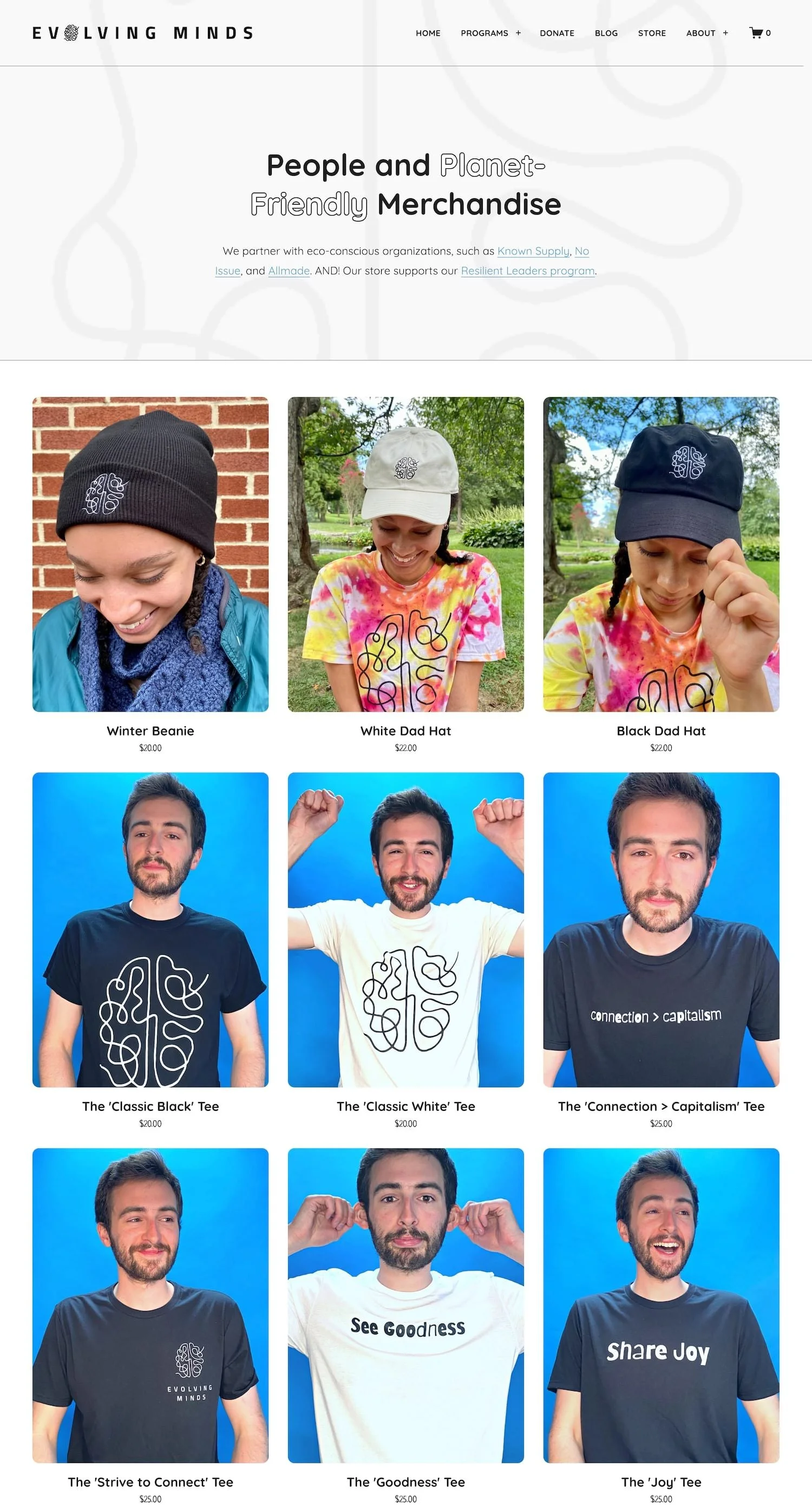
#26. Evolving Minds
Evolving Minds is a mental health non-profit that offers resilience and mindfulness trainings to students, employees, and organizations. Their site primary focuses on their programs but they do have a small ecommerce shop where they sell some cool merch. Their product images are fantastic and give off a very millennial vibe which fits their mission well. The ecommerce portion of the site is simple, clean, and user-friendly. This site nicely showcases what you can do with a Squarespace shop without overcomplicating things.
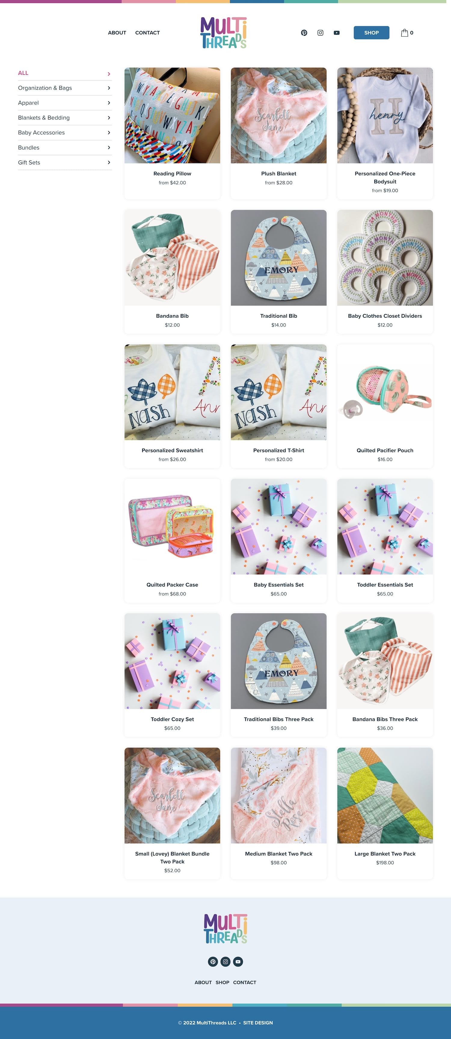
#27. MultiThreads Embroidery
MultiThreads Embroidery sells quilted and personalized gifts for kids. Their products are handcrafted, made with high-quality materials, and made custom just for you. In addition to selling stand-alone products, this shops also sells gift sets and bundles which works well for their client base whom are likely searching for gifts. This site links out to Etsy where customers can actually purchase the products.
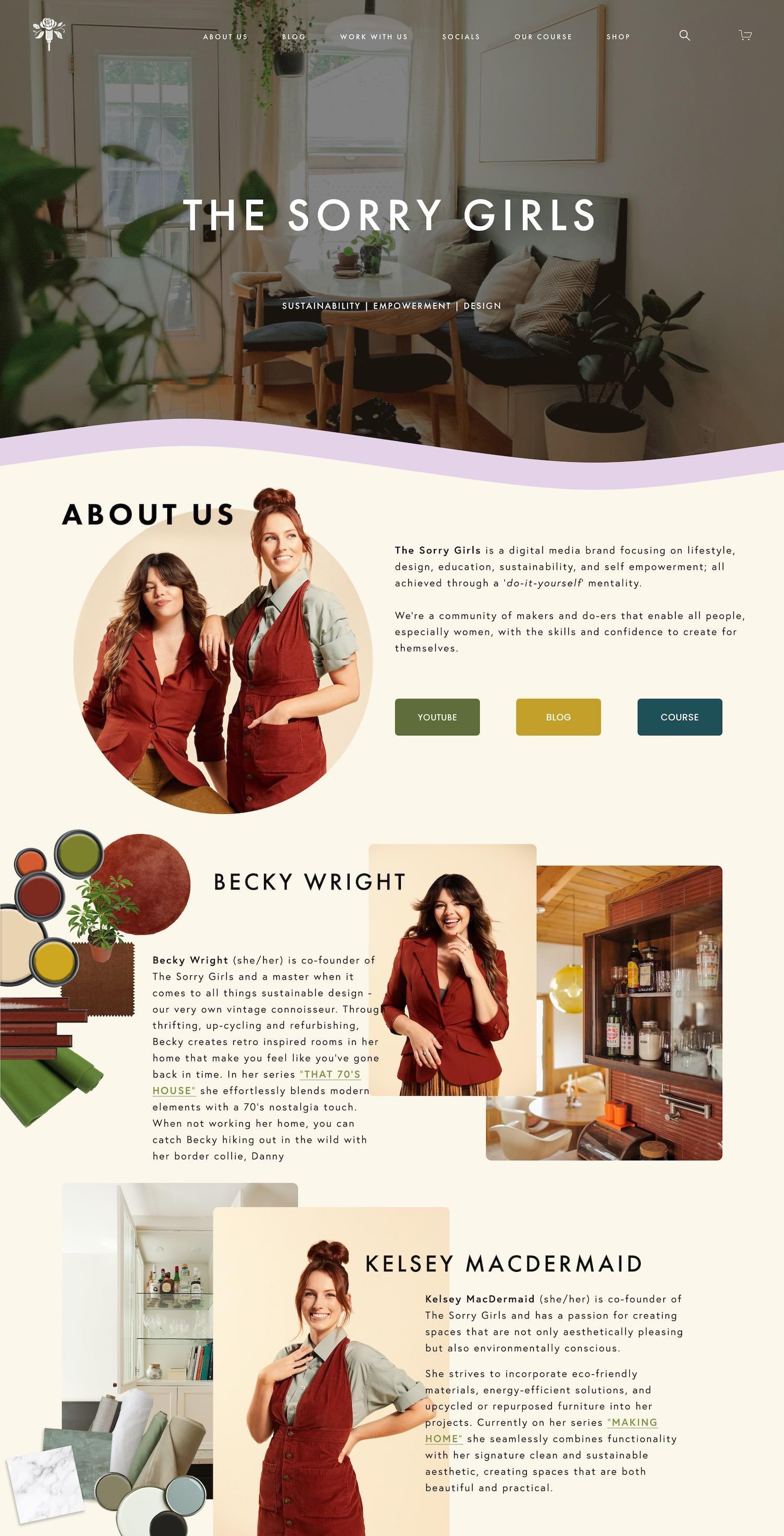
#28. The Sorry Girls
The Sorry Girls is a digital media brand focusing on lifestyle, design, education, sustainability, and self empowerment. They are absolute masters when it comes to all things sustainable design. On their website, they sell digital products in the form of downloadable, printable PDFs that teach users how to DIY they’re own sustainable products such as air pods cases, side tables, headboards, and more.
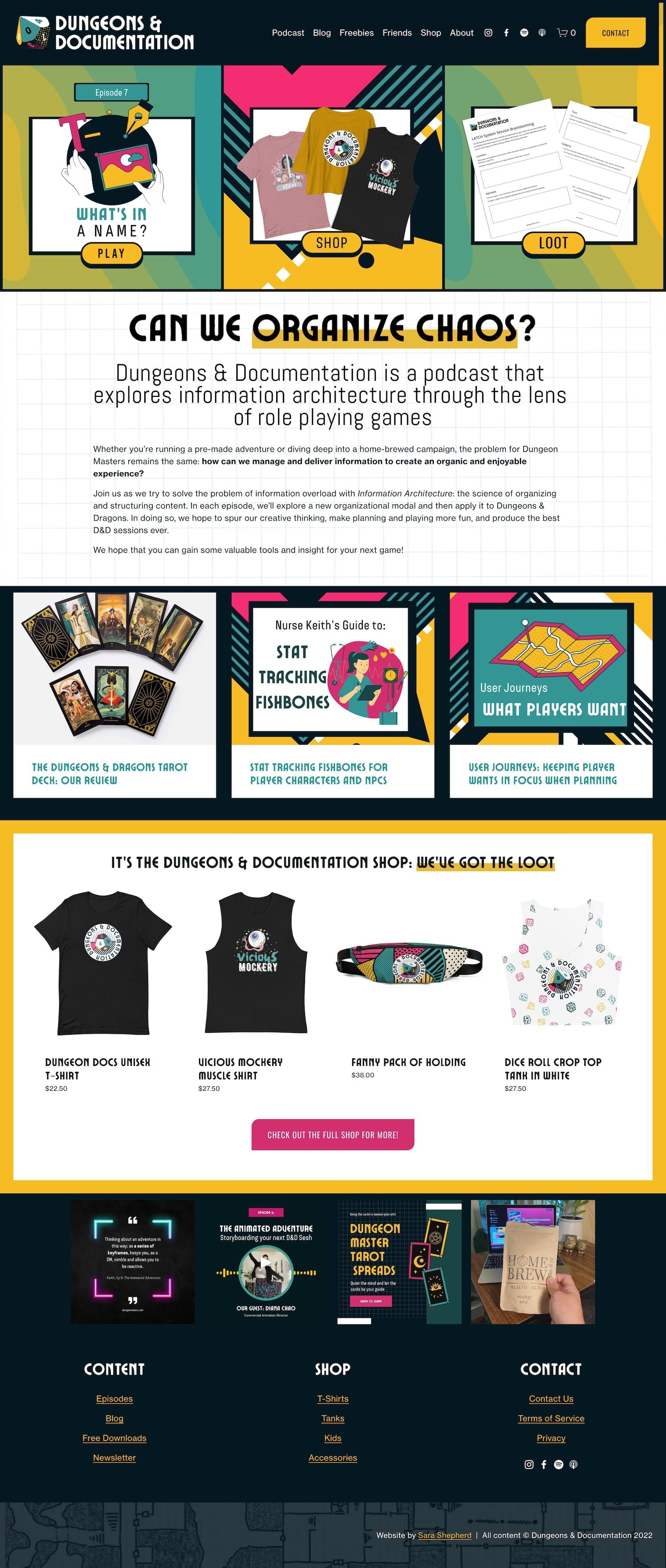
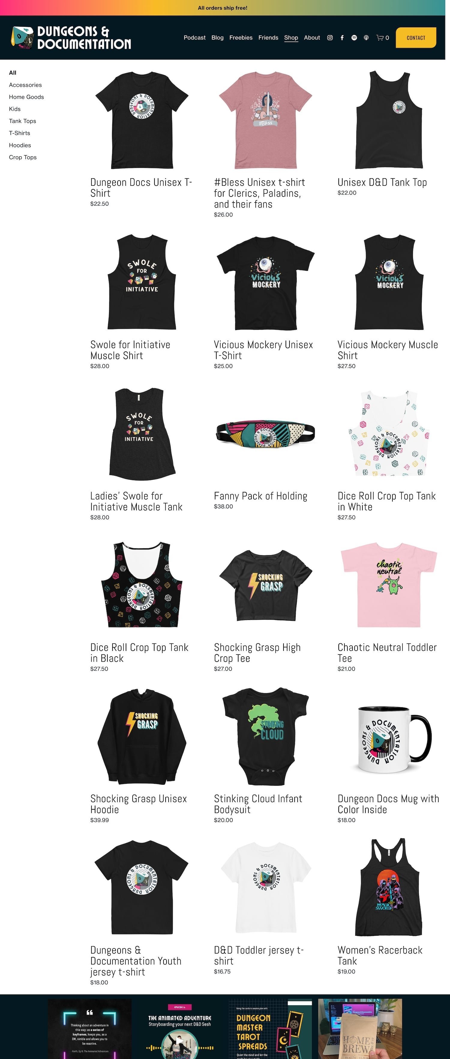
#29. Dungeons & Documentation
Dungeons & Documentation is a bold, energetic type of ecommerce website. They are primarily a dungeons and dragons themed podcast, but they also sell dungeons and dragons related merch on their Squarespace site. With their bright colors and creative typography, they certainly make their branding stand out and leave a lasting impression on the user, which is definitely want you want to do when selling products online.
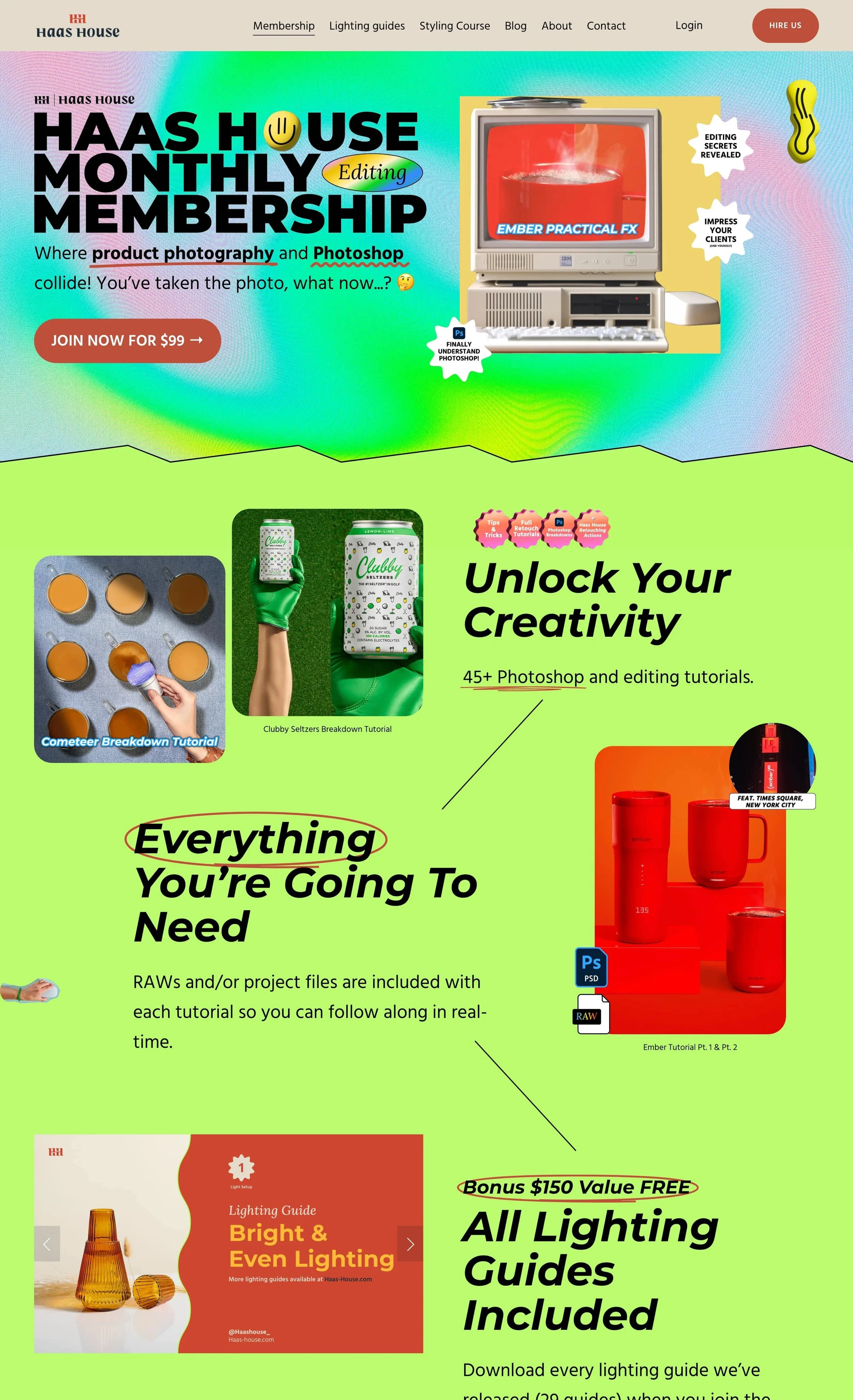
#30. Haas House
Haas House sells monthly memberships and lighting guides to teach you everything you need to know about product photography and editing in Photoshop. Their website is designed to be bright, bold, and fun, offering an engaging online experience for visitors. With vibrant colors, dynamic typography, and lively visuals, the website reflects a modern and energetic aesthetic that helps captivate their ideal crowd.
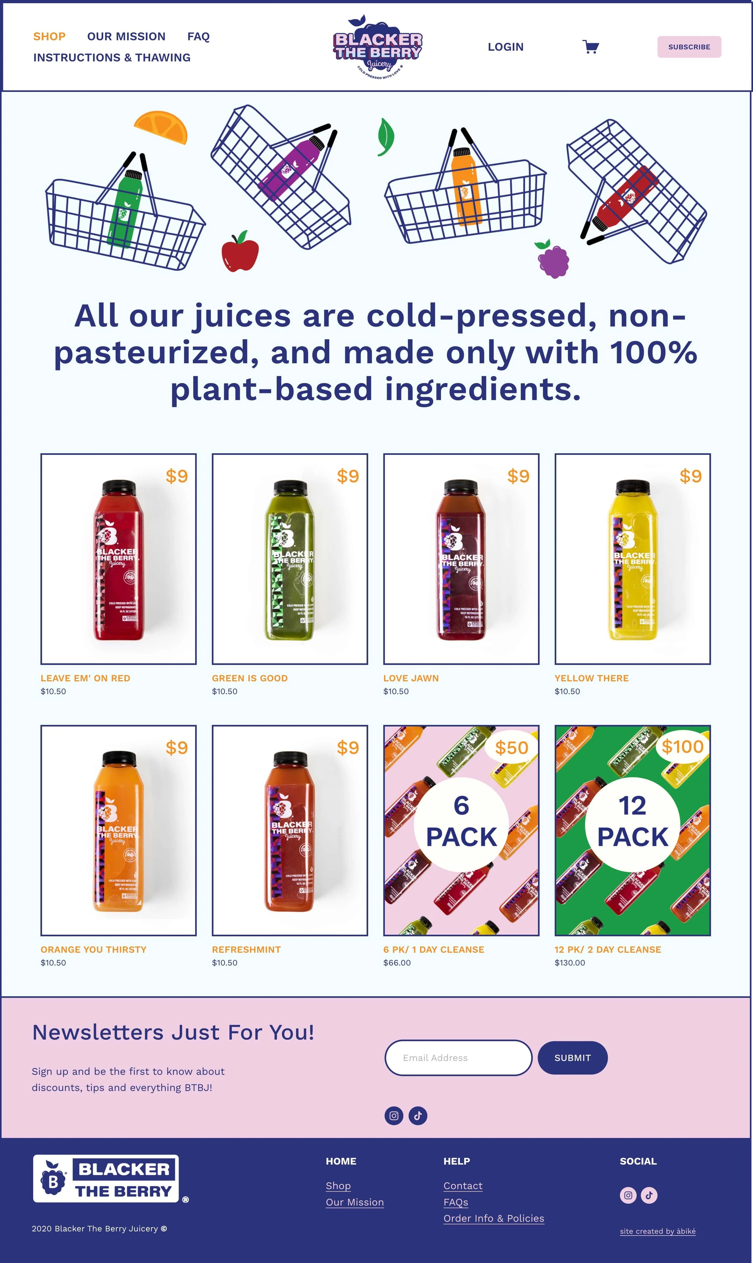
#31. BTB Juicery
Blacker The Berry Juicery is a brand focused on building a global community around health and social justice. They are on a mission is to inspire others and spread love through healthy food options. Their visually appealing website captivates visitors from the moment they land on the page, creating an engaging and delightful user experience. Additionally, their user-friendly interface (built with Squarespace) ensures that navigating the website and making a purchase is a seamless and enjoyable process.
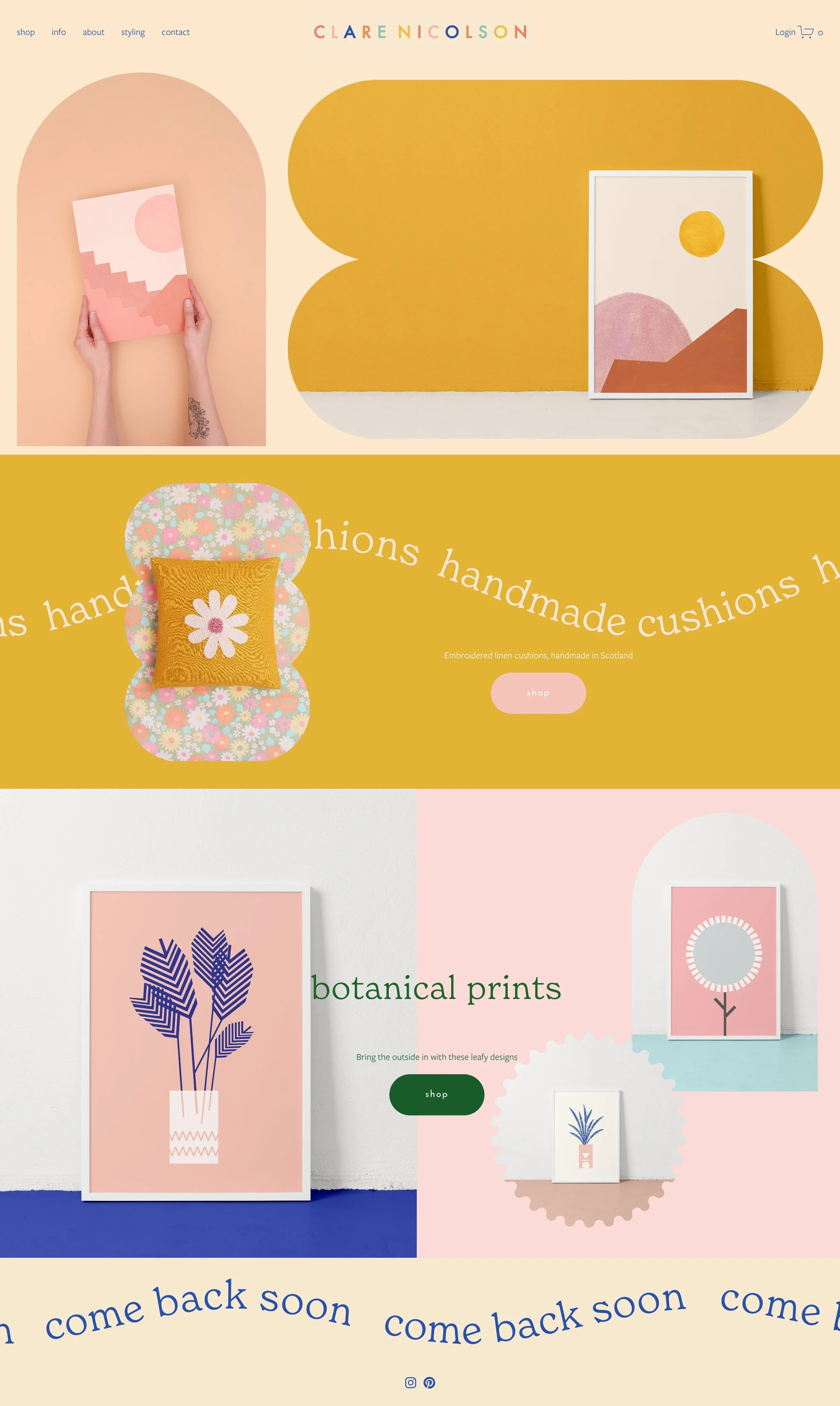
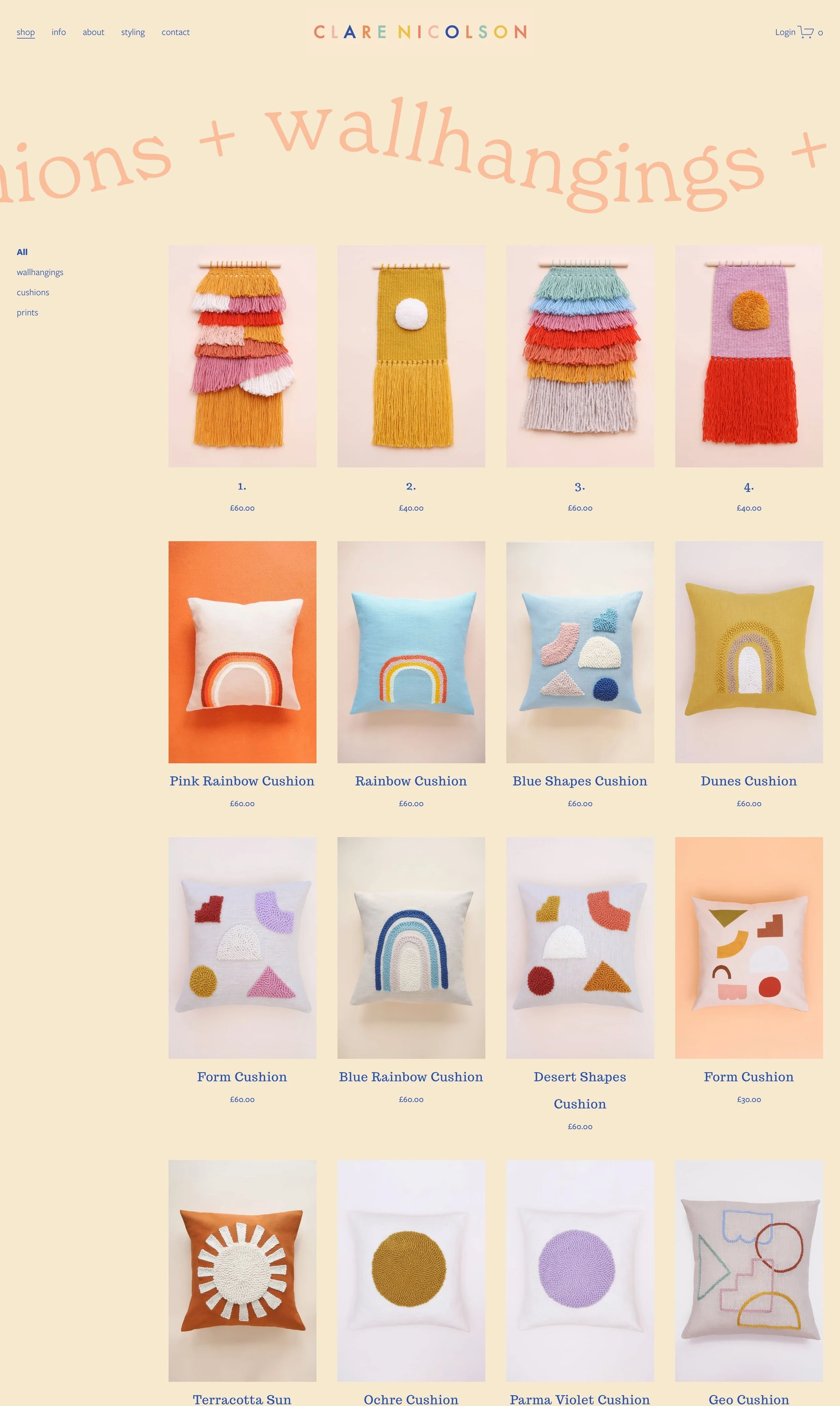
#32. Clare Nicolson
Clare sells handmade cushions, botanical prints, and wallhangings on her Squarespace store. I love how she makes use of Squarespace's funky shapes on her shop to help add an engaging and dynamic element to the overall site flow. The playful and creative vibes of her site really demonstrate Clare's unique approach to design, giving the user an idea of what you can expect when you purchase one of her products.
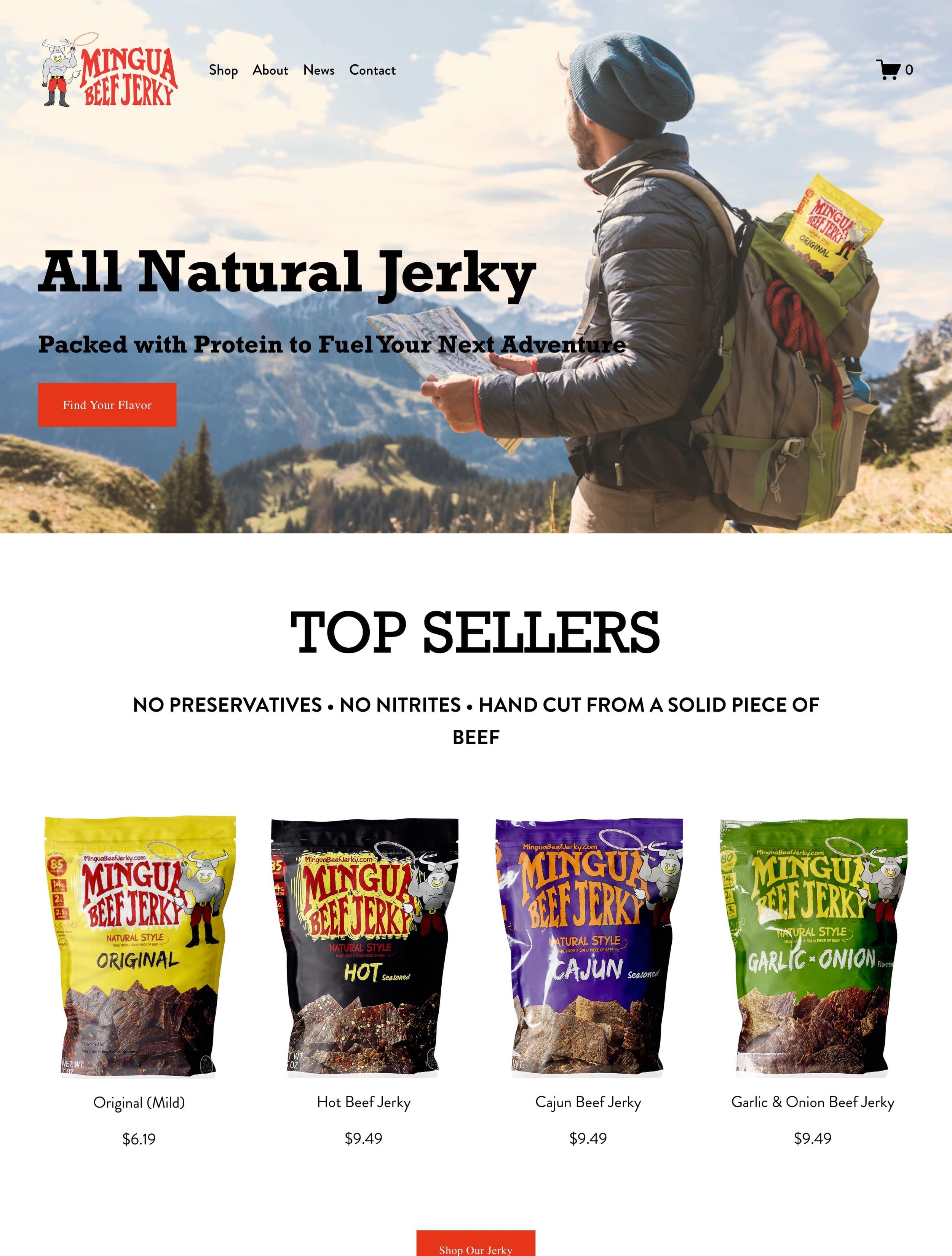
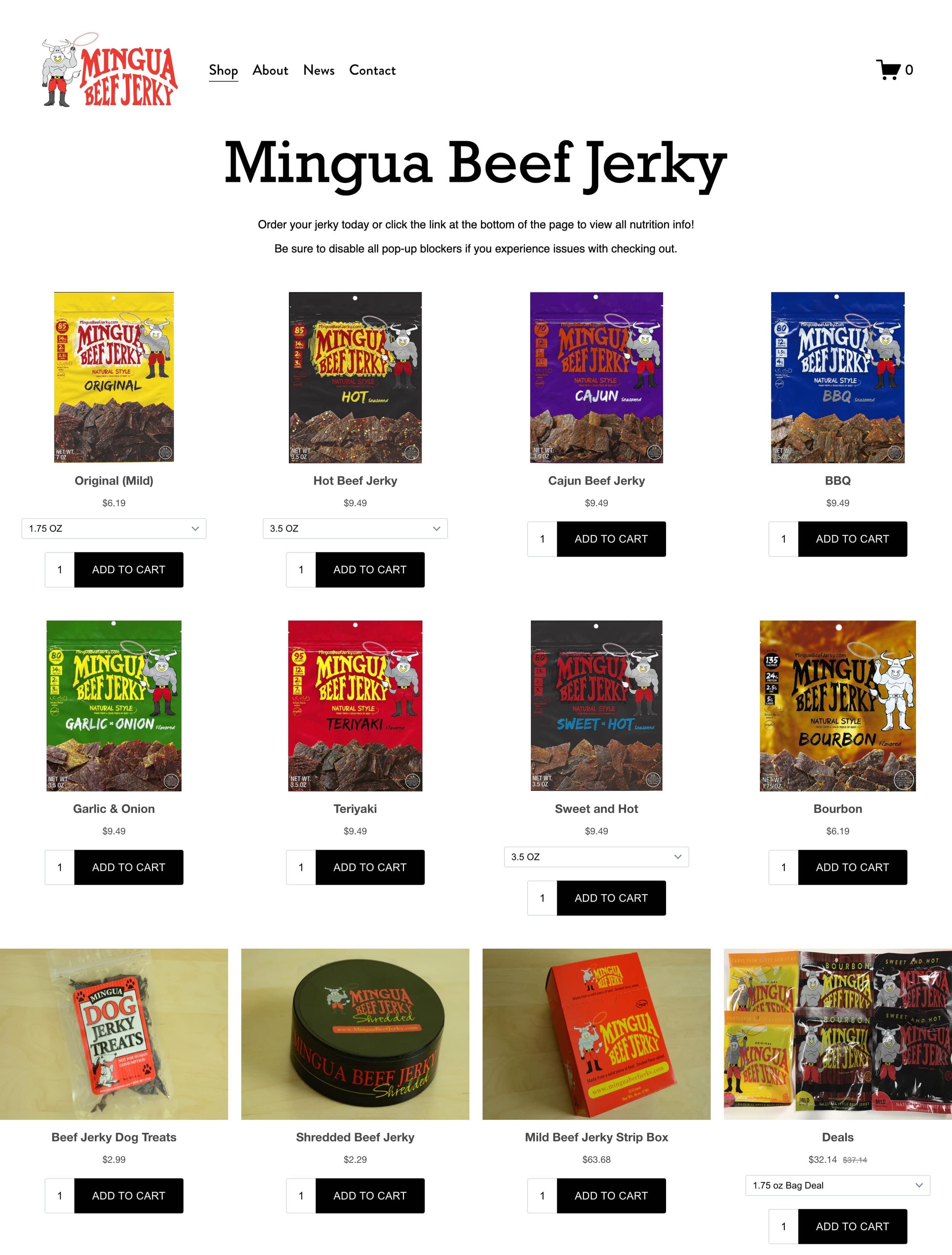
#33. Mingua Beef Jerky
Mingua Beef Jerky is a family owned company that sells all natural jerky from Kentucky. Their website exudes a warm, welcoming vibe with it’s soft color palette and user-friendly layout. Their homepage hero image is wonderful. It perfectly encapsulates what their brand is all about - nature, adventure, and good jerky!
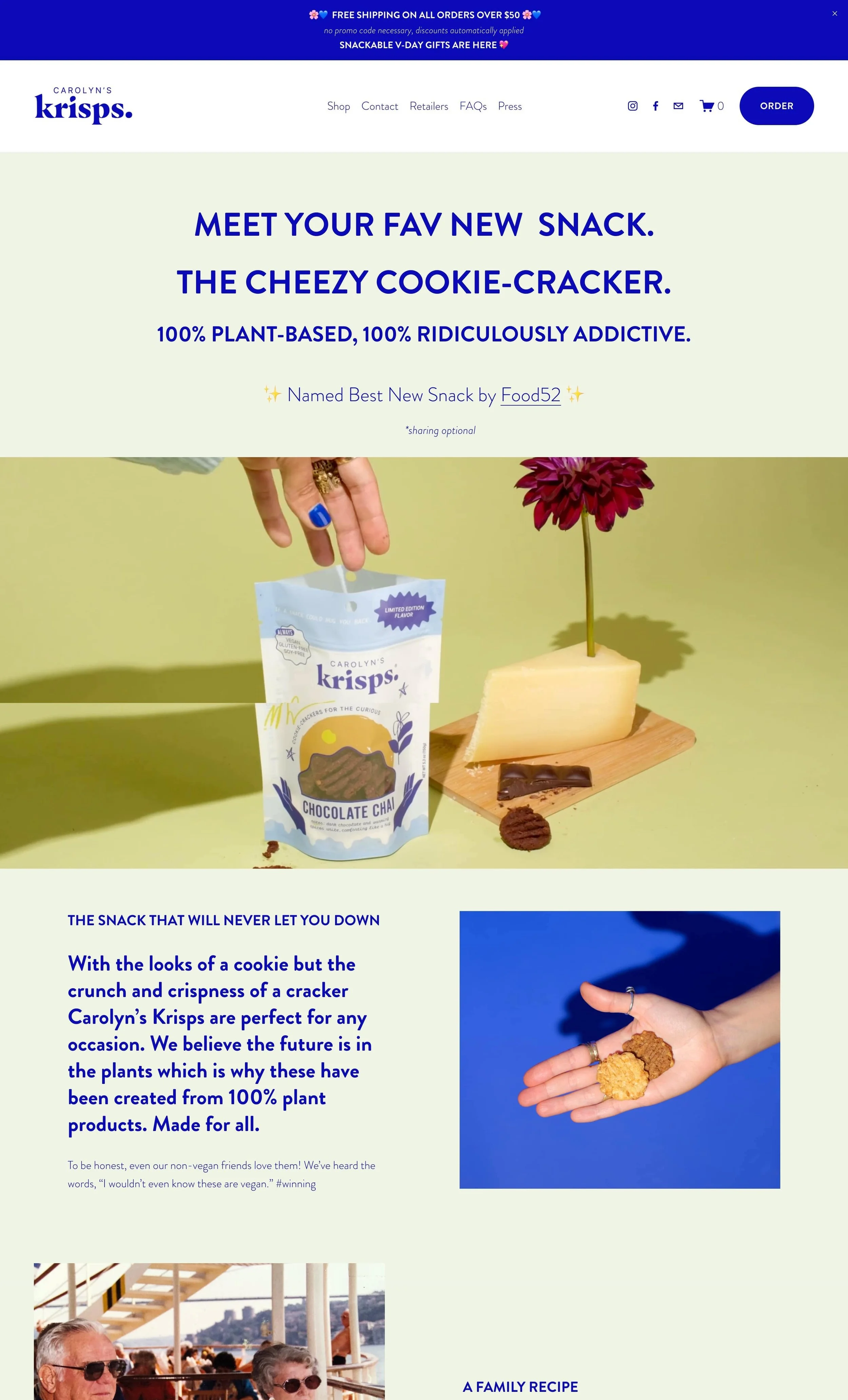
#34. Carolyn’s Krisps
Carolyn’s Krisps sells plan based cheesy cookie crackers that are ridiculously addictive! I love the video GIF they use on their homepage showing a person reaching into the product bag - super engaging! Their large, detailed images are also wonderful and really helps the customer get a feel for the product.
#35. MILK Boutique
MILK Boutique is an innovative online boutique that merges contemporary fashion with personalized styling services. Their Squarespace website showcases a simplistic and minimal design, which enhances the shopping experience by allowing customers to focus on the curated selection of clothing and accessories. They even sell gift cards on their website, which is a great feature for any online shop!
PHEW 😅 There you have it! That completes this giant list of some of my favorite Squarespace ecommerce shops. Keep reading below for some tips on how to maximize the potential of your Squarespace store!
How To Maximize The Potential Of Your Squarespace Store
Are you looking to improve your shop? Make more sales? Gain more valuable leads? Obtain more repeat customers? You can use the simple optimization techniques outlined below to help drive conversion, grow sales, get more customers, and ultimately take your Squarespace Ecommerce store to the next level.
Ensure the Design + Layout of Your Store is Intuitive:
The design of your store should be inviting, easy to navigate, and intuitive for customers to use. It's important to pick a template that doesn’t detract from the customer experience — keep it simple with bold colors and clear product images.
Making sure that all buttons are big enough and clearly labeled will make customers more likely to click around and complete purchases. Furthermore, make sure everything is working properly; any broken links or visual errors can turn customers off quickly!
Optimize Your Product Pages for Speed and Performance:
Loading times are key when it comes to maximizing customer experience — research shows that 79% of shoppers who are dissatisfied with website performance are less likely to buy from the same site again.
Optimizing your product pages for speed and performance is essential for improving customer satisfaction and ensuring each page loads quickly and efficiently. Compressing images, not using custom fonts, and enabling AMP can help improve loading times and keep customers on your site longer.
Leverage Squarespace’s SEO Features:
Squarespace provides a variety of built-in tools to help optimize your pages for better performance on search engines. This includes easy optimization of titles and descriptions, as well as image alt tags to improve your site’s overall visibility in search results. Utilize these features to get the most out of your Squarespace store!
If you’re looking to master Squarespace SEO, consider working with an SEO Expert or taking a course. Two fabulous Squarespace SEO courses are Tiffany Davidson’s Squarespace SEO Expert Course and Kate Scott’s Grow With SEO*. Additionally, Semrush* is a super comprehensive SEO tool that can help you improve your Google rankings by identifying keywords you should be targeting on your site.
Create Simple and Clear Navigation:
A simple, intuitive website navigation is essential to creating a great user experience on your ecommerce store. Visitors should have a clear idea of where they are and where they can go at all times.
Design a straightforward navigation that makes the most sense to users by selecting the right categories and tags. Use language, names, and designs that your customers will recognize and understand for easy navigation through your site. Consider purchasing the Universal Filter Plugin* from Squarewebsites. This plugin allows you to easily add sort + filter functionality to your shop.
Include Direct and Engaging Product Descriptions:
Writing engaging and informative product descriptions is key for enticing customers to purchase your products. Make sure you write clear, concise descriptions of every item on your site and include any relevant details such as specs, sizing, color options, and more. This will help to enhance the user experience by providing customers with all the information they need to make an informed decision when shopping on your site.
When in doubt, think about working with a copywriter* to help come up with effective product copy.
Did you enjoy this article? Check out more articles like this in the Squarespace Blog. In the blog, I share tips for hiring Squarespace Designers (or becoming one!), custom CSS and Javascript solutions, latest Squarespace news and updates, my favorite plugins, Squarespace Template Shops, and more!
Browse Premium Squarespace Templates
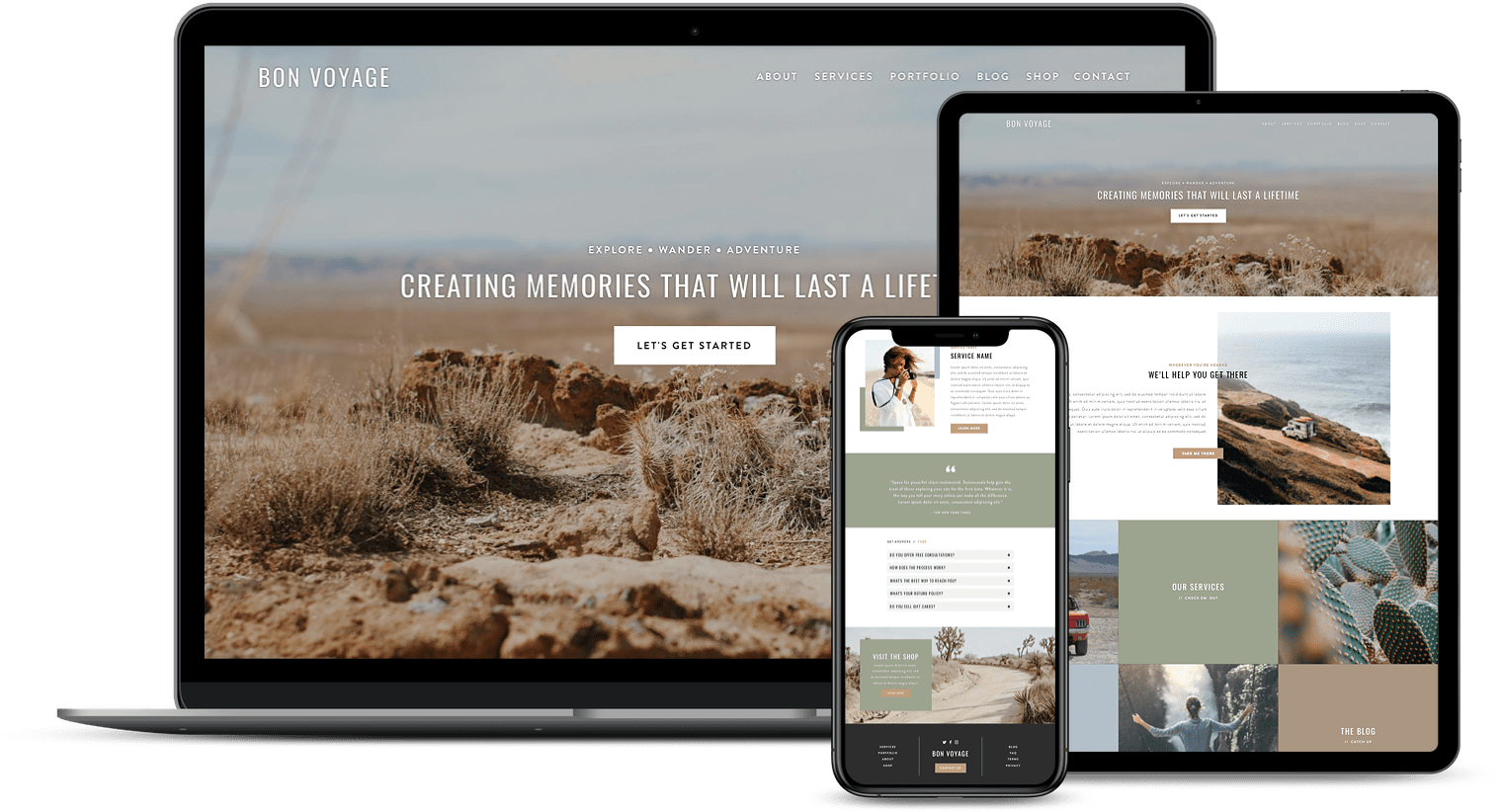
My modern, service-based templates are designed for entrepreneurs and small businesses who are looking for a professional website design without breaking the bank. Each one of my templates include video tutorials for easy content upload / style tweaks. I also include my Advanced SEO Guide (a $500 value). This guide contains the exact techniques I use to help my SEO clients land on Google page 1.





















![50+ Best Premium Squarespace Template Shops [2025]](https://images.squarespace-cdn.com/content/v1/5fac4b921ca05f08cb315e40/1735848204800-I3GDILCDSSJO3EM3BVAW/Premium+Squarespace+Templates%2C+Squarespace+Templates%2C+Squarespace+Templates+For+Sale%2C+Best+Squarespace+Templates%2C+Custom+Squarespace+Templates%2C+Squarespace+Premium+Templates%2C+Squarespace+Website+Templates%2C+Squarespace+Custom+Templates.jpg)
![15+ Best Squarespace Plugins [2025]](https://images.squarespace-cdn.com/content/v1/5fac4b921ca05f08cb315e40/1694728480567-VI2YDT6NUD3M24LSQI9Z/Squarespace+Plugins%2C+Best+Squarespace+Plugins%2C+Squarespace+Design+Plugins%2C+Best+Squarespace+7.1+Plugins%2C+Squarespace+Animation+Plugins%2C+Squarespace+Commerce+Plugins+%2B+Squarespace+Plugins+7.1%2C+Squarespace+Plugins+For+Ecommerce%2C+Squarespace+7.1+Plugins.jpg)
![Cost To Hire An Expert Squarespace Web Designer [2025]](https://images.squarespace-cdn.com/content/v1/5fac4b921ca05f08cb315e40/1676998633226-ZZZ9ELM4Z5HOSV0F3RWI/Squarespace+Web+Designer+Pricing%2C+Squarespace+Designer+Pricing%2C+Squarespace+Web+Designer+Cost%2C+Squarespace+Designer+Cost%2C+Squarespace+Website+Designer+Cost%2C+How+Much+Do+Squarespace+Designers+Charge%2C+Squarespace+Website+Designer.jpeg)
